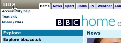
Home Link
Design Pattern
Alternate titles: Go Back to a Safe Place.
Solution
- Create a link to the starting point or front page of the website on the site’s logo on every single page on the website.
- If the site does not have a logo, then create a link to the front page of the website with the text ‘Home’.
- The link and/or linked images should always be in the same location on all pages.
- If the website has more than one home, then be sure to make the distinction in linking between the root home and the local home.
Rationale
It has become a standard in webdesign, that the site’s logo is always linked to a safe start location for the user. Normally, this is the front page of the site, but it could also be the front page of a section in the site, or some other safe start location for the user.
This article has been commented 3 times.
User Interface Design Patterns
- Forms
- Explaining the process
- Community driven
- Tabs
- Jumping in hierarchy
- Menus
- Content
- Gestures
- Tables
- Formatting data
- Images
- Search
- Reputation
- Social interactions
- Shopping
- Increasing frequency
- Guidance
- Registration
Persuasive Design Patterns
- Loss Aversion
- Other cognitive biases
- Scarcity
- Gameplay design
- Fundamentals of rewards
- Gameplay rewards

3 comments
koji on Jun 18, 2009
I don’t know if this a local problem, but i applied some usability tests on logo link to home page. Only hardusers are able to predict the link. Regular users still trying to search a “home” link with text. :( Not so great for a clean design…
David on Jul 14, 2010
My experience with users confirms koji’s comment. An important % of users do not consider naturally the logo as the home page. Definitively i would recommend always a specific home page link next to the main navigation items
Sydney Smith on Apr 06, 2011
It is amazing that users that define themselves as saavy do not know this standard. Instead of giving it such prominence on the main navigation, I place it in the utility links (upper right hand corner.)
Comments have been closed