Vertical Dropdown Menu
Design Pattern
Problem summary
The user needs to navigate among sections of a website, but space to show such navigation is limited.
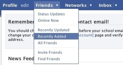
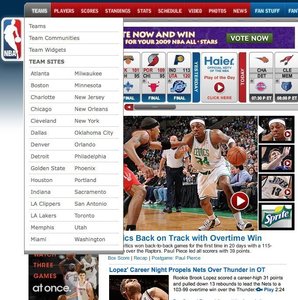
Example

Usage
- Use when there are between 2 – 9 sections of content that need a hierarchical navigation structure.
- Use when your functionality resembles one of a desktop application. Imitate the metaphor.
- Do not use when there is a need to single out the location of the current section of the site. Then use the Navigation Tabs.
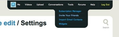
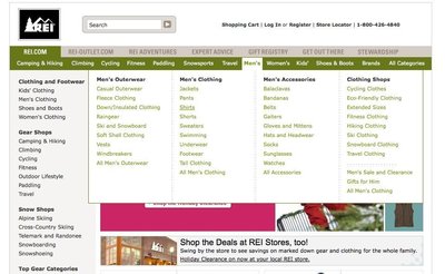
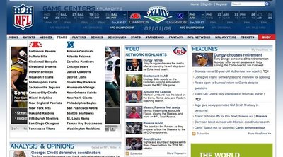
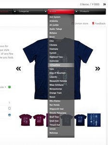
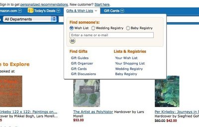
More examples


Solution
A list of main sections is listed on the same horizontal line. Once the user has his mouse cursor over one of the list items, a drop-down list of new options is shown below the list item the mouse cursor is pointing at. The user can then follow the now vertically extended list item down, to select the menu item he wants to click.
Once the user removes the cursor from the box of drop-down’ed options, the box disappears. He can then put his mouse cursor over another list item, whereafter the process starts over.
As humans, we do not always act perfectly as the system would like us to. To cope with human errors and to guide us to act as you would like us to, you can implement the following:
- On mouseout events (when the user takes his mouse away from the drop-down’ed box), add a delay before hiding the drop-down’ed box (typically 200-300 ms.)
- Make the area of each menu item wider than just the text of the menu item so that the user has more space to put his mouse cursor over.
- Change the cursor image as the user hovers over a list item.
Other issues you want to take notice of:
There are many different kind of drop-down menus out there. Some work only – and is built purely with javascript. These kinds of drop-down menus do not work well with search engines. To let the search engines index your page, you would want to have the menu formatted in HTML from the beginning of the page load, rather than building it in javascipt client-side after the page has loaded.Rationale
Drop-down menus save space. This is the main reason for using them. Otherwise, drop-down menus are not regarded as a technique that increases usability, as they can often be difficult to use.
Flyout menus allow for only showing top levels of the page’s hierarchy permanently, while still giving the option to show deeper levels on mouse over.
More examples of the Vertical Dropdown Menu pattern See all 32 example screenshots
User Interface Design Patterns
- Forms
- Explaining the process
- Community driven
- Tabs
- Jumping in hierarchy
- Menus
- Content
- Gestures
- Tables
- Formatting data
- Images
- Search
- Reputation
- Social interactions
- Shopping
- Increasing frequency
- Guidance
- Registration
Persuasive Design Patterns
- Loss Aversion
- Other cognitive biases
- Scarcity
- Gameplay design
- Fundamentals of rewards
- Gameplay rewards
4 comments
J.P.Salvador on Jul 14, 2008
MENU PATTERN
Arun on Jun 24, 2010
If a website is given to be design. how to do you arrive to come up with a easy to use navigation pattern.
Other day i went to an interview, the interviewer couldn’t clearly explain the business case scenario. here’s his case…he has about 5 main links and each of this link has 4-5 sub level links(screen with information)… and he wants all the main level and sub level links information to be shown in one single screen… it is possible to show so many screens info. in one screen? doesn’t it confuse the user with too much of data been presented to user in one single screen…
i suggested and combination of left side vertical menu and tabs for displaying the sub level information. the guy was not convinced with my answer
if yes, can anyone suggest/advise. what combination of patterns will have to be used to come up with a easy to use navigation and a high level screen design.
Thanks
D-Coder on Sep 14, 2010
It’s annoying when these trigger automatically. The mouse has to be somewhere, and if it happens to be over a menu tab, the page automatically blocks a huge part of what I’m looking at.
I prefer these to trigger only on a mouse click. I know whether I want to see the menu better than your page knows.
Christian Oestreich on Feb 14, 2012
I also suggest implementing a short delay before the menu layer is being triggered.
Common case: A mouse pointer is somewhere in the content section of a website. The main navigation is positioned horizontally above the content section. Even further above, there are additional menu items, e.g. site logo or meta navigation, search, etc.
If I want to move the mouse pointer to the top of the page in order to perform a search (or anything else), there is no way to pass the horizontal main navigation without triggering the menu (although the mousepointer is just a few milliseconds above it). This leads to an annoying flickering. Adding a short delay prevents this unwanted effect without compromising UI responsiveness too much. We got good results with 200ms.
Comments have been closed