Fat Footer
Design Pattern
Alternate titles: Sitemap Footers.
Problem summary
Users need a mechanism that will enable them to quickly access specific sections of a site or application bypassing the navigational structure.
Example
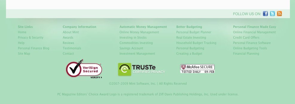
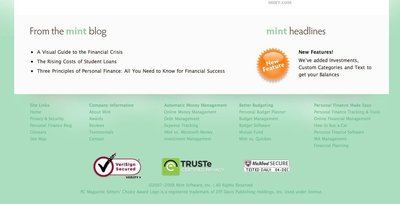
▲ The fat footer of mint.com has a high focus on conveying a sense of trust in that the service is secure.
Usage
- Use to shortcut an otherwise hierarchical structure of a website.
- Use when there are specific pages or functions that are more frequently used than others parts of the website. Use the shortcut box to show these choices in order to shorten the path for the users.
- Use when you want shortcuts to pages that are possibly on different hierarchical levels of the page.
- Can also be used as navigation when short on space, although it is not advised.
This card is part of the UI Patterns printed card deck
A collection of 60 User Interface design patterns, presented in a manner easily referenced and used as a brainstorming tool.
Get your deck!Solution
End a page by providing relevant links to other sections of your site.
Add the same footer on all pages of a website – with the same layout in the footer on all pages. Typically, these things are included in fat footer designs:
- About us link: Link to your “about us” section, which then includes basic information about your company.
- Terms of service: If you provide a service or a product, placing a link to it in the footer is a standard location, why users anticipate it being there.
- Privacy policy: As with the terms of service, users expect to always be able to find privacy policies in the footer of a website.
- Site map: Provide quick links the most important pages of your website.
- Contact us link: Make sure your users have a way to get in hold of you. If you have a “Contact us” page, users expect to find a link to it in the footer. This is also a critical point in building the trustworthiness of your site as it is displaying your physical address.
- Address and phone number: Show that you are real. If you have a physical business, offer phone support, or have a reason for people to mail you things, putting that information in the footer is an anticipated and appropriate location.
- Social links: Link to any social presences you might have on Facebook, Twitter, Pinterest, Instagram, and the likes.
Rationale
Keep visitors on your site for longer: end one experience by starting a new one. Provide easy and natural ways for users to continue their journey. By adding a shortcut to the most frequently used pages and functions, the path can be shortened and confusion can be decreased.
The hierarchical structure of a website can at times impede the path to specific page or function of a website. By adding a shortcut to the most frequently used pages and functions, the path can be shortened: the number of clicks can be lessened and the confusion decreased.
Discussion
A fat footer isn’t right for every site or for every company. Consider asking these when creating a footer:
- What does my user expect to see here?
- What is the next logical step in the user journey?
- What questions are my secondary or tertiary users still asking at the bottom of the site?
- How can I continue the experience beyond the content on this page?1
1 Fat footer round-up at UX Booth.
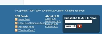
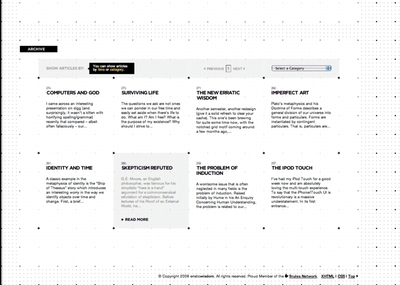
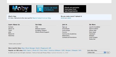
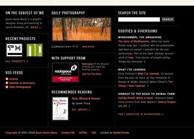
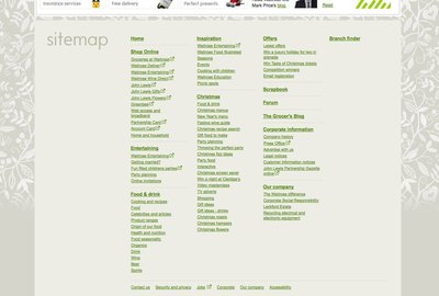
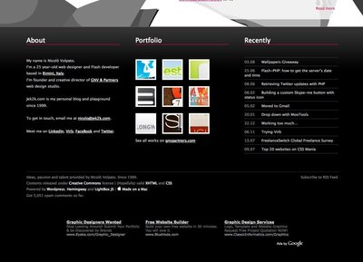
More examples of the Fat Footer pattern See all 84 example screenshots
User Interface Design Patterns
- Forms
- Explaining the process
- Community driven
- Tabs
- Jumping in hierarchy
- Menus
- Content
- Gestures
- Tables
- Formatting data
- Images
- Search
- Reputation
- Social interactions
- Shopping
- Increasing frequency
- Guidance
- Registration
Persuasive Design Patterns
- Loss Aversion
- Other cognitive biases
- Scarcity
- Gameplay design
- Fundamentals of rewards
- Gameplay rewards



7 comments
Rob on Mar 20, 2009
I’ve been calling these “Sitemap Footers” because they often replace the function of the old “sitemap” link. These Fat Footers are also useful for covering ADA requirements.
MDX on Jul 18, 2009
These footers do make great sitemaps -as long as the site structure is not too large. Also, CTA like a newsletter signup can make a second appearance in the footer as well.
kungkk on Aug 27, 2009
yeap, we call it sitemap footer instead of fat footer
Brp Web Design on Oct 26, 2009
Nobody seems to use sitemaps. I personally love when I see a well structured footer with navigation.
David Friend on Jun 10, 2010
I like these fat footers and I want one. Anyone know where I can get the code? Or perhaps you want to design one for me for a stipend?
Andy Wight on Jun 18, 2010
I prefer not to refer to them as a “sitemap footer” as they are a departure from the hierarchical structure of the main navigation and often a subset of what I would normally show in a sitemap.
There are scenarios on smaller sites where the footer ends up being equivalent to the sitemap but I think there is a difference between exposing select items in the footer and the full breadth that a sitemap shoots for.
David on Jul 14, 2010
Fully aree with previous comment. Sitemaps and fat footers are just different. Another issue is that for small websites could be almost equal. The definition for fat footers on this page is clear.
Comments have been closed