Inplace Editor
Design Pattern
Alternate titles: Direct Manipulation.
Problem summary
The user needs to quickly and easily edit a value on a page
Example
Usage
- Use when the user only needs to edit one value (or very few) and not many
- Use when the value the user needs to edit is of a simple format, i.e. a text string, in a dropdown box.
- Use if you want the user to be able to edit a value without actually going to an administration page, but by staying on the same page.
This card is part of the UI Patterns printed card deck
A collection of 60 User Interface design patterns, presented in a manner easily referenced and used as a brainstorming tool.
Get your deck!Solution
Let users edit values in the same place as they are displayed. Provide an easy way to let users edit parts of a page without having to be redirected to an edit page. Typically, hover effects are used to invite editing.
The Inplace Editor pattern allows for localized editing of elements on the fly. The pattern provides ease of editing by placing the controls right next to the elements they affect.
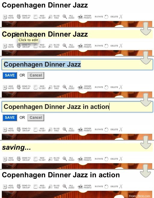
For example, when in editing mode of an application, a page title element will display editing controls when the user hovers their mouse over it. The elements background color is highlighted and a tooltip is shown prompting the user to click the element to edit it. Once the user clicks the element, it is transformed into an input field (text, dropdown, etc.). A save button and a cancel button are also displayed. Often, the input field matches the styling of the original element. If the original element was a header written in size 20pt, the size of the font in the input field would also be 20pt. This styling is mirrored to ensure that the user can connect the original element with the new editable
The user can then edit the value of the input field (which is the same as the original elements value) and click save or cancel. If ‘save’ is clicked, the value is saved through an AJAX call to the underlying database, the value of the element is updated and the element is returned to normal view. If cancel is clicked, the element is changed back to the original view without any changes.
This pattern is often combined with AJAX techniques, which is an asynchronous call to the server through javascript that does not require a refresh of the page. There are many javascript libraries available online that deliver ready-to-use inplace editors.
Rationale
An in-place editor provides an easy way to let the user edit parts of a page without having to be redirected to an edit page. Instead, the user can just click around on a page and edit the elements he or she wishes to change – without reloading the page.
More examples of the Inplace Editor pattern See all 2 example screenshots

User Interface Design Patterns
- Forms
- Explaining the process
- Community driven
- Tabs
- Jumping in hierarchy
- Menus
- Content
- Gestures
- Tables
- Formatting data
- Images
- Search
- Reputation
- Social interactions
- Shopping
- Increasing frequency
- Guidance
- Registration
Persuasive Design Patterns
- Loss Aversion
- Other cognitive biases
- Scarcity
- Gameplay design
- Fundamentals of rewards
- Gameplay rewards


4 comments
Lindsey on May 28, 2008
Very useful! I love this feature in Google docs…I’m able to edit the title of a document without leaving the page or dealing with a popup window. One of the best UI developments I’ve seen recently.
Peter on Aug 15, 2008
I would add a bullet to the usage list:
I.e. – the text that can be edited shouldn’t contain verbs (links, actions), only information. If the texts on the page are intermixed information and verbs, than do not use inline editing. This is based on maintaining a clear distinction between usage and administration.
syed sabir on Sep 24, 2010
This type feature is available in meebo too…
Jay K on Oct 26, 2010
The affordance that Google Contacts (consumer edition, not the enterprise edition) gives upon mouseover — displaying an input box around the text — is much clearer to my mind than a simple highlight. I think this will become more and more popular.
Comments have been closed