Accordion Menu
Design Pattern
Problem summary
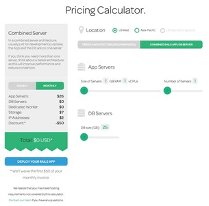
User needs to navigate among a website's main sections while still being able to quickly browse to the subsection of another.
Example
Usage
- Use when you want the benefits of a normal sidebar menu, but do not have the space to list all options.
- Use when there are more than 2 main sections on a website each with 2 or more subsections.
- Use when you have less than 10 main sections
- Use when you only have two levels to show in the main navigation.
Solution
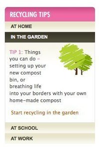
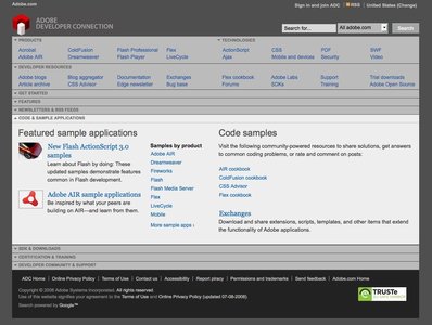
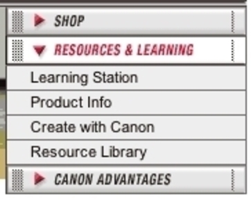
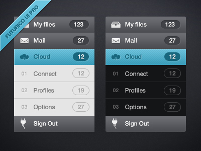
- Each headline / section has a panel, which upon clicking can be expanded either vertically or horizontally into showing its subsections. Vertical Accordion menus are the most frequently used.
- The transition from showing no options of a headline to showing a headline’s list of options can be done either with a page refresh or with a javascript DHTML animation.
- When one panel is clicked it is expanded, while other panels are collapsed.
Rationale
Accordion menus are often used as a website’s main navigation. In this way, it acts much like Navigation Tabs, as menu items are collapsed when a new panel is clicked. Where the Navigation Tabs are most often used horizontally, Accordion menus are most often used vertically.
Accordion menus can however also function quite well as sub-navigation for a specific section of a website.
This article has been commented 3 times.
More examples of the Accordion Menu pattern See all 11 example screenshots
User Interface Design Patterns
- Forms
- Explaining the process
- Community driven
- Tabs
- Jumping in hierarchy
- Menus
- Content
- Gestures
- Tables
- Formatting data
- Images
- Search
- Reputation
- Social interactions
- Shopping
- Increasing frequency
- Guidance
- Registration
Persuasive Design Patterns
- Loss Aversion
- Other cognitive biases
- Scarcity
- Gameplay design
- Fundamentals of rewards
- Gameplay rewards






3 comments
bingo on May 06, 2008
too many menus will be trouble and verbose .
sometimes people will boring
dvir on Jul 21, 2009
when browsing onoe piece, and then the user wants to go to another, she needs to browse the other section titles on both endings of the accordion (above and under for vertical, and to the left and to the right for the horizontal)
this problem makes the accordion not suitable for case when the user needs to browse the menu frequently.
Adrian on Sep 18, 2014
This pattern is terrible for on-page searching if the section doesn’t expand when navigated to. See Wikipedia website on a mobile phone
Comments have been closed