Continuous Scrolling
Design Pattern
Alternate titles: Infinite Scrolling, Endless Page, Endless Scroll.
Problem summary
The user needs to view a subset of data that is not easily displayed on a single page Content needs to be presented to users as a subset of a much larger seemingly endless set, in a way that will aid them in consuming content without effort.
Example
Usage
- Use when there are more data to show than what would fit on a normal page
- Use when navigating to a second page of data takes away too much attention from the content
This card is part of the UI Patterns printed card deck
A collection of 60 User Interface design patterns, presented in a manner easily referenced and used as a brainstorming tool.
Get your deck!Solution
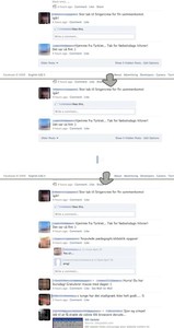
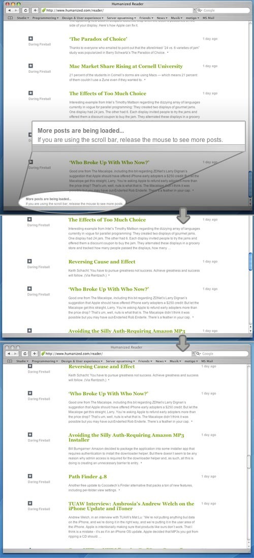
Automatically load the next set or page of content as the user reaches the bottom of the current page
In contrast to the Pagination patterns, the Continuous Scrolling pattern has no natural break. When using pagination patterns, a decision to only show a subset of data at a time and then let the user request more data if wanted is chosen. With the Continuous Scrolling, new data is automatically retrieved as the user has scrolled to the bottom of the page. It thus appears as if the page has no end, as more data will be loaded and inserted into the page each time the user scrolls to the bottom of page.
Rationale
Eliminate the need for clicking “next page” by creating the effect of an infinitely scrolling page by constantly loading in new content as the user scrolls to the bottom of a page. Though great for the user experience, this pattern introduces bookmarking issues.
The problem with using pagination for browsing between subsets of data is that the user is pulled from the world of content to the world of navigation, as the user is required to click to the next page. The user is then no longer thinking about what they are reading, but about how to get more to read. This breaks the user’s train of thought and forces them to stop reading. Using pagination creates a natural pause that lets the user reevaluate if he or she wants to keep going on or leave the site, which they a lot of the time do.
It can be argued that Continuous Scrolling can be frustrating for the user, as there is no natural pause. The user will ask himself: When am I done reading?
More examples of the Continuous Scrolling pattern See all 3 example screenshots

User Interface Design Patterns
- Forms
- Explaining the process
- Community driven
- Tabs
- Jumping in hierarchy
- Menus
- Content
- Gestures
- Tables
- Formatting data
- Images
- Search
- Reputation
- Social interactions
- Shopping
- Increasing frequency
- Guidance
- Registration
Persuasive Design Patterns
- Loss Aversion
- Other cognitive biases
- Scarcity
- Gameplay design
- Fundamentals of rewards
- Gameplay rewards


18 comments
Martijn van Welie on Feb 03, 2008
There are several downsides to this pattern such user expectations and bookmarking issues. Can these issues be dealt with? If so, how?
Matt Katz on Feb 07, 2008
This pattern sidesteps some issues that pagination has.
Continuous scroll is good for large lists that the user has no way to jump predictively forward. What does it mean to want to go to the 4th page of google’s search results – you are just saying that nothing you’ve looked at so far met your needs. Continuous scroll is much better there.
Where users could make a rational jump to a page, pagination is better.
Continuous scroll > paginations when:
Pagination > Continuous Scroll:
baruch sachs on Mar 04, 2008
Does anyone have any experiences with using this style of scrolling with large datasets ( >10,000 rows)? What type of performance and scaleability issues have people found?
Anders Toxboe on Mar 06, 2008
Baruch sachs: I do not see how performance would be an issue especially for this pattern as compared to regular paginated pages. The user isn’t forced to read 10.000+ rows, but will stop scrolling down, when he or she has “had enough”. Besides, the ajax call will only load the actual extra content (the extra list items) – and won’t have to deliver all the extra header and footer html and image files will that is normally needed on page refreshes.
The main flaw of this pattern is in my opinion the changed behavior of the regular web page – that the user does not know what to expect. Will the user actually realize that extra content is loaded? Will he or she be confused by the continuous scrolling? This pattern is still experimental, if it will ever be anything else than that in its current form.
Janko on Mar 25, 2008
I think this patter could confuse average user – it is not typical behaviour and it is not something user would expect.
If the list is a result of a search, you can use pagination, filtering and sorting to enable user to find specific item(s). If it is just a endless list user will browse anyway – so paging will be good enough.
Justin Robinson on Mar 31, 2008
Perhaps a simple line “Show me more…”, when clicked you go on with your ajax load of the next XX number of items/content blocks. Leave the decision in the hands of the user.
Limo on Mar 17, 2009
I can see how this would be useful, for example in search engine results you could simply use continuous scroll to get to the next page until you find what you want, instead of using pagination.
Kenny on Jun 16, 2009
>>What type of performance and scaleability issues have people found?
With potentially large datasets, continuous scroll can be a means to reduce the load – an example might be a banking transaction history page, where the initial load showing the most recent transactions only. The user then has the option to drill down view ‘more’ further if they are interested.
This pattern is especially applicable where there is a need to avoid high-cost transaction count queries, which are usually required for conventional pagination.
It’s also a pattern that performs very well with mobile applications and/or ajax applications, where the reduction of page size is important.
Sys on Feb 22, 2010
Cool site, this is my first time here, and I’m enjoying it so far!
For the continuous scrolling functionality, I believe the overhead issue is being misinterpreted.
There is not going to be an unusual impact to load-times; that’s true. However look at the browser memory usage when you start having the single session hold onto quite so much in a single pane. That’s the real overhead of this approach. I guess if widely adopted, this could cause browser memory footprints to balloon yet more (they’re already pretty abhorrent these days).
That and the difficulty in referencing a “spot” of interest. After-all is is common behavior with pagination to go through 5 pages, and remember “There was something I needed on page 3. . . which I’ll go back to after I check 2 more pages just to be sure”.
Perhaps something like a floating marker that can be set for any particular viewed screen? E.g. a floating “+” that rides along mid-page or lower 2/3rds of the page (which is where the scroll bar will tend to live). If Clicked, it sets a number, or optionally allows users to add a note like “cool item here!”. The # or note floats up to the top of the screen, and may be clicked at any time to return to that particular “view” in large page.
As more items are marked, they could move to the top, and move items to the left, forming what looks like an ad-hoc row of tabs.
My 2 cents, but I think this may solve at least some of the concerns.
Manoj on Jul 16, 2010
Take a look at Google Books – aren’t they implemented this effectively in terms of browser memory?
Google Books keeps 3 to 5 pages in memory at once (in HTML DIVs) – this also depends on which zoom level you are in. When you scroll down they add new DIVs to the container DIV and remove the old ones.
I think the continuous scrolling is very cool idea. At least for books, reports, or anything that comes as lot of pages.
Justo on Sep 16, 2010
I agree with @Matt Katz, this pattern description is out of date and does not address important issues of scrollers representing the total scope of the windows contents. Its not just as a vertical pagination pattern as suggested here.
The example even breaks the standard scroller behaviour which is…
1. The position of the drag bar represents where it is in the total list.
2. The size of the drag bar represents the size of the displayed items in relation to the total.
3. Clicking below the drag bar takes you down a page and above takes you up a page.
4. Clicking an arrow moves you up one line or down one line.
Deviating from this causes confusion.
Mindaugas Kuprionis on Sep 20, 2010
I’d add to Matt Katz’
Continuous scroll > paginations when:
- When user scans items top to bottom
And this I believe is very important condition.
Concerning braking of scroller behavior – if user is scanning items top to bottom, one at a time, he would use scrollbar only to scroll a little. But in that case there always should be items below the fold – so that user doesn’t notice stuff is being loaded (except that scrollbar changes).
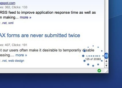
If he jumps straight to the bottom, there should be an indicator saying “we’re loading more”.
Lydia Mann on Sep 29, 2010
I call this anxiety attack scrolling – totally stresses me out when I realize I have no control over the amount of information being presented. I stop reading the content and focus on where I am in the data set.
CN on Oct 15, 2010
The implementation we built does not use the OOTB scrolling page, but a div with a widget’d scrollbar. The scrollbar precalculates position based on amount of content available; i.e., if you have a table with 10,000 rows, dragging the scrollbar to the halfway point would roughly fetch you row 5,000+ with buffer either direction.
The caveat is that each row must be of fixed height to correctly account for positioning.
Karla on Jun 28, 2011
This kind of page will become more common because of smart phones, where loading pages can be very slow.
David L on Sep 12, 2011
i agree with Karla. Just look at google images, i think that this will become more
and more used in the near future. Excuse my bad english.
Rob M on Mar 30, 2012
I have enjoyed continuous scrolling on certain blogs. But…
What about navigation?
Fixed position header that scrolls with the page (or some sort of navigation widget)?
“To the top” links for each listing (i.e. result, item, row, etc) that links to an “anchor” in the header?
Any thoughts or additional solutions?
Simone Gianni on Apr 02, 2012
Main problem I have with this patters is that it completely breaks footers. In Facebook for example, I was trying to click on a link in the footer, but simply could not reach it for three/four times, it keps moving downwards.
I think correct implementation of this pattern should create empty divs, with a reasonable height to accomodate for “pages” that will be loaded later, and then employ a “scroll lock” algorithm, so that if I’m at the bottom of the page it keeps me there even if loading intermediate stuff “moved” the page.
Moreover, “empty divs in the middle” makes it also easier to implement it : suppose i have a 1000 rows “dataset”, i could create 100 divs, each with a reasonable height for 10 rows (adapt it as needed depending on your data), then watch for scroll events, check which divs are in the viewable area (+/-1 eventually), and load inside those div the right “pages”, eventually unloading all the others (that is reverting them to empty divs, keeping height), also solving the memory issue.
Comments have been closed