Alternating Row Colors
Design Pattern
Alternate titles: Striped tables, Zebra striping.
Problem summary
The user needs to visually separate similar looking rows in a table apart, in order to match the values of each row.
Example
Usage
- Use when you have several columns in a table
- Use when the content of each column is often of similar nature
- Use when there are multiple lines for each row
- Use when the height of each row varies
Solution
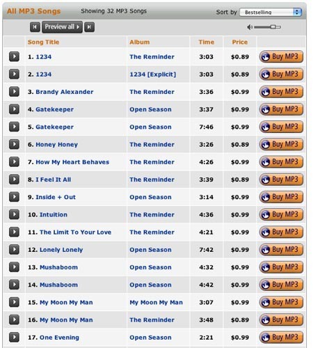
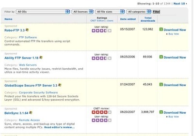
To differentiate table rows from each other, a different shade is used as background color for every second row. Keep the difference between the two colors to a minimum to preserve a gentle feeling. The colors should be similar in value and low in saturation – the one should be slightly darker or lighter than the other. It is often seen that one of the two colors is the background color of the page itself.
Rationale
The purpose of the shading in every second row is only to provide an visual aid for the every users to follow a row from the left to the right and back again – without confusing one row with another. The purpose is not to drastically change the design of the table.
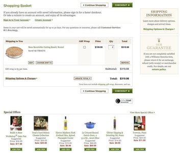
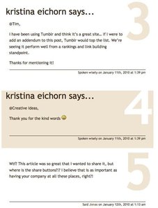
A side effect of shading every second row with an alternating color is however that the table will stand out from the rest of the page. The shading in this way boxes in the table.
More examples of the Alternating Row Colors pattern See all 7 example screenshots
User Interface Design Patterns
- Forms
- Explaining the process
- Community driven
- Tabs
- Jumping in hierarchy
- Menus
- Content
- Gestures
- Tables
- Formatting data
- Images
- Search
- Reputation
- Social interactions
- Shopping
- Increasing frequency
- Guidance
- Registration
Persuasive Design Patterns
- Loss Aversion
- Other cognitive biases
- Scarcity
- Gameplay design
- Fundamentals of rewards
- Gameplay rewards



4 comments
Mona on Apr 09, 2009
Zebra stripping doesn’t work in interactive apps where there are mouse overs, selects, inline edits etc. I think it was great in the paper world but is outdated and even damaging in web apps of today.
Josh Johnson on Aug 27, 2009
I disagree that it fails to work in interactive apps. I’ve created quite a few examples of subtly shaded alternating row colors with highly contrasted hover and selection colors, so even from an accessibility standpoint it remains functional. That said, the designer needs to make a choice about whether it makes sense or is causing visual distraction. I rarely find that alternating colors and visually delineated boxes around the cells are both required (as shown in the example), but when you’re striving for high data density, trading an extra pixel per row for the border in exchange for alternating background colors can be the right choice.
Michael on Jul 13, 2010
I don’t like doing this with every alternating row. Instead I prefer rows in groups of three. This is especially useful when you have long horizontal rows as it enables the eye to keep track of where you are at easier. With every other row alternating in color, it is too easy for the eye to wander up or down.
Something else to keep the eye from wandering, is to use the mouse. You can use the “hover” pseudo class. In MSIE (at least to 8) this only works on the anchor (“a”) tag, but in other browsers it works on everything (I think). This enables the user to use the mouse to select which row they are reading, and then just leave the mouse over it. (You could probably use “mouseover” to do this in JavaScript so it works in MSIE.)
And, postscript. What about having hover on column headings so that you can change the background color on columns as well? Probably needs JavaScript …
drivermac on Jan 11, 2012
Yes, I think it was great in the paper world but is outdated and even damaging in web apps of today
Comments have been closed