Wizard
Design Pattern
Alternate titles: Setup Wizard.
Problem summary
The user wants to achieve a single goal which can be broken down into dependable sub-tasks.
Example

▲ The wizard used to get an insurance quote at homesite.com uses a highlighted tab in the menu to communicate the purpose of the wizard, uses the good default pattern for selecting options, has a clear communication of the wizard length as well as how far the user has gone, uses large navigation buttons, has all its content above the fold, and provides a nice alternative to the wizard by letting the user talk to a real-life person for assistance.
Usage
- Use when the user needs to perform a task or a goal that dictates more than one step.
- An example is adding an image to a website which can include uploading the image and cropping the image; the image cannot be cropped before it is uploaded to a server.
- Use when the user needs to perform a complex task consisting of several dependable sub-tasks.
- Use when the user needs to input complex data into a system but the tasks is more easily achieved by splitting the process into a series of smaller and simpler steps.
- Use when the user needs guidance: the user wants to achieve an overall goal, but may not be familiar in the steps needed to reach the goal.
- Use when the steps needed to reach a final goal may vary due to decisions made in previous stages.
- Use when the user lacks necessary domain knowledge.
- Use when the user must complete steps in a specific sequence.
This card is part of the UI Patterns printed card deck
A collection of 60 User Interface design patterns, presented in a manner easily referenced and used as a brainstorming tool.
Get your deck!Solution
Break down a single goal into dependable sub-tasks.
The task of inputting data into the system is parted into multiple steps. Each step is presented to the user one at a time.
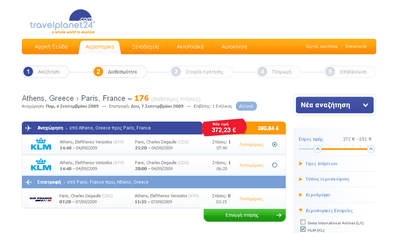
The user should be presented with information about the steps that exist, progress through the process and which steps are completed.
The Wizard pattern is very similar to the Steps Left pattern. The difference between the two is the focus. Where Steps Left is focused only on explaining the steps of a process, the Wizard pattern is about parting dependable sub-tasks needed to perform a complex goal into separate steps.
The Wizard pattern is also different from the Steps Left pattern in that the steps needed to perform a goal can vary depending on the information inputted in earlier stages. In this way, the Wizard pattern separates itself from being merely an visible aid for the user.
Buttons
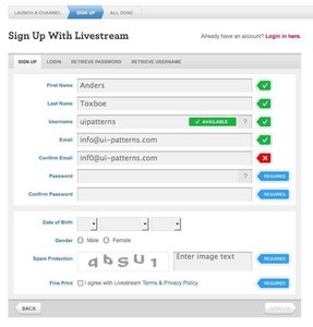
Basically, a wizard is a series of screens or dialogue boxes walking users through from start to completion. Each screen asks the user to input information by either making selections or filling in fields. After inputting data, users navigate through the wizard by clicking navigation options like “Previous” and “Next”. At the final step users click “Finish” instead of “Next”, which thus indicates the completion of the wizard.
It is also good practice to include a “Cancel” button on all screens that will lead the user back to where he or she came from. Typically, a “Cancel” button is located near other navigation buttons, but in a position that clearly separates the button from the “Previous” and “Next” buttons. Furthermore, it is also good practice to provide a warning if data inputted up to that point will be lost clicking the “Cancel” button. It is fair for to assume that the user expects that he or she can return to the wizard later and start from where they left off3. In order not to frustrate the user more than necessary, the consequences of exiting the wizard should be communicated.
Wizards are meant to be fast and easy. For this reason, it is a good idea to keep the content of a screen as well as its navigation above the fold.
Keep the purpose clear: explain
Keep the wizard’s purpose clear on every screen by placing a clear and concise label on every screen. Optionally accompany the label with a brief explanation of the wizard’s purpose on the first screen. This will help users remember why they entered the wizard in the first place and how they will benefit from finishing the wizard.
Use plain language
Users of a wizard aren’t necessarily experts, why you should refrain from using technical jargon to prompt users. The language used should fit in to the user’s frame of reference5.
Summarize choices
It is good practice to present a summary of choices made throughout the wizard to the user near the end of the wizard. This will allow the user to review and double-check inputted data before the final “Finish” button is clicked. In the case the user wishes to change the data entered, he or she should be able to navigate back to the given page where the date was entered. If the amount of steps in the wizard is greater than 8-10, it is a good idea to provide links directly to the screen of the data input.
Good defaults
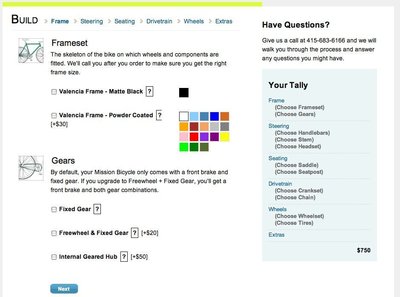
A wizard is a perfect place for using Good defaults. Most wizard users are not familiar with the task they are performing and are thus unfamiliar with the values for the choices they are asked to make.
Rationale
By splitting up a complex task into a sequence of chunks, you can effectively simplify the task. Each chunk represents a separate mental space, easier to deal with alone than as a whole. Contrary to the Steps Left pattern, the steps needed to perform a goal can vary depending on the information inputted in earlier stages.
By separating complex tasks needed to achieve a goal into several steps, the process of inputting data can take several different directions depending on what input is entered.
The complex task of inputting large amounts of dependable data can be adjusted and streamlined to fit the decisions of a user throughout a process. In the context of decisions the user makes in each step, unnecessary steps can be cut out and important steps can enter into the focus.
In a system with many variables, a user can reach their goals by manipulating these variables in different ways. The Wizard pattern can be used to group such variables into separate goals. This will convert the task of completing a complex goal from multiple disparate actions into a coherent process.
When users are forced to follow a set of pre-defined steps they are less likely to miss important aspects of a process and will thus commit fewer errors.
Minimum of training
Wizards are often made for the untrained user. For this reason, make sure your wizard can be completed without training. A rationale behind using a wizard is to avoid training for rare or intimidating tasks – not to develop expertise5.
Discussion
Using the Wizard pattern helps the user perform a complex task, but can at the same time it effects the performance time of the task.
An effective wizard breaks down a complex tasks into sub-tasks and possibly sub-sub-tasks. Sub-tasks are sequenced in a way that feels familiar and comfortable for the user using task analysis. Task analysis is conducted before screen design begins and is best done observing real users performing the task in their own work environment. The output of the task analysis is an outline and information architecture for the wizard.
Keep the amount of screens low
By breaking a task up into too many screens, there is a chance of disorienting the user. If it takes too long to finish the wizard, the user may get annoyed and possibly abandons the wizard before finishing it.
Be careful not to make each step too long
While the amount of screens should be limited, you should not always keep the amount of screens to a minimum. When a screen of a step in your wizard grows to a height that does not fit into a regular screen solution, there is a risk of annoying the user and making the wizard tiresome to finish as it forces the user to scroll to enter data and navigate back and forth. Consider breaking such steps up into two or more screens.
To find out whether you have hit the right balance between a low number of screens and short screen heights, put your wizard through a usability test. It is hard to define other means of checking when a good balance between the two has been found.
Allow alternatives to using the wizard
A wizard support users performing a task by lowering the learning curve. Use of a Wizard supposedly increases user performance, in much less time than without the use of a wizard. It however comes with the cost of “dumbing down” the task as users perform tasks without fully understanding them and being aware of the underlying decisions5. The result is users not being able to perform a task if the wizard is not available as well as not being able to fine tune decisions made by manipulating other parts of the system.
A wizard should not be the only way for users to complete a task, but merely an alternative to another more complicated method of completing the same task. Use a wizard for allowing the untrained user to get started quick and let the more experienced users, who prefer more flexibility than the wizard allows, use the more complicated method.
Sources
1 Wizard design pattern by Jenifer Tidwell.
2 Wizard design pattern by Martijn van Welie.
3 Crafting a wizard by Jodi Bollaert.
4 More Web-based wizard tips and tricks by Jodi Bollaert.
5 Designing wizards by Saul Carliner
6 Wizards and guides by Bob Baxley at Boxes and arrows.
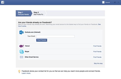
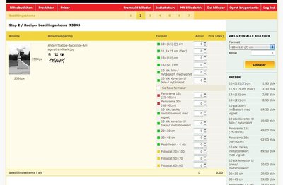
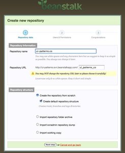
More examples of the Wizard pattern See all 39 example screenshots



User Interface Design Patterns
- Forms
- Explaining the process
- Community driven
- Tabs
- Jumping in hierarchy
- Menus
- Content
- Gestures
- Tables
- Formatting data
- Images
- Search
- Reputation
- Social interactions
- Shopping
- Increasing frequency
- Guidance
- Registration
Persuasive Design Patterns
- Loss Aversion
- Other cognitive biases
- Scarcity
- Gameplay design
- Fundamentals of rewards
- Gameplay rewards



4 comments
DarioB on Feb 19, 2009
First, from Italy
UI Redesign on Aug 27, 2009
The simplicity of this design really smokes the detailes DB system made at the backend. Truly phenomenal.
Francis on Jan 05, 2010
I think the underlying promise of the wizard is that you can go Next > Next > Next … > Finish virtually without reading the content, and still have something usable at the end of it (lots of users, among them me, usually proceed in that fashion). Or failing that, if a choice or selection is mandatory, that it should be obvious. The wizard can provide loads of options and selections so users can deviate from the default behavior, but supporting the next-next-next dummies to me is the most important thing.
Massimo on Jan 22, 2011
This is the exact UI Pattern we need to expose, and would appreciate if any reader could recommend us some tool in the market to cater for our requirements:
We need to create hundreds of very complex Wizards on the site but all the examples here seem very simple sequential ones. Also there are many decision points in the flows. Another requirement is that the flows are quite dynamic in that they can regularly be changed. Without a powerful tool, creating and maintaining this volume of Wizards is just no possible in code.
Thanks for your feedback.
Massimo
Comments have been closed