Carousel
Design Pattern
Alternate titles: Slideshow.
Problem summary
The user needs to browse through a set of items and possibly select one of them
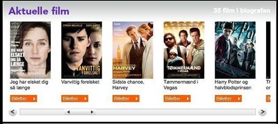
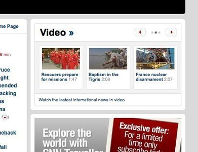
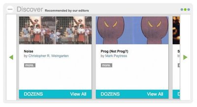
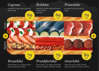
Example
Usage
- Use when you have a large set of items to show, but want to
let the user concentrate his or her attention only on a select few items at a time - Use when you want to tease the user by letting him or her know that there are more items available than what is currently shown.
- Use when you do not have enough space to show all items at once.
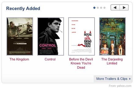
- Use when you have highly visual items to display such as movie posters, album covers, products etc.
- Do not use when the items are non-visual such as links to text articles, PDF documents etc.
- Do not use when the content linked to cannot be immediately identified by an image.
More examples


Solution
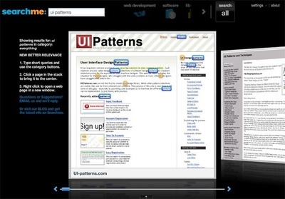
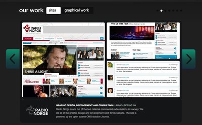
Arrange a set of items on a horizontal line where each item preferably has an thumbnail image attached (or the item is only represented by the image). Even though the list of items is long, only 3-8 images are shown at the same time.
If the user wants to view the rest of the items on the list, he or she must click one of the navigational controls such as an arrows pointing either left/right or up/down. Once one of the arrow is clicked, the subsequent “view” is loaded, a transitional animation moves the requested item into focus. The user can in this way browse the list of items back and forth in a circular fashion – hence the name Carousel.
Rationale
A carousel optimizes screen space by displaying only a subset of images from a collection of images in a cyclic view.
The navigational controls on a carousel suggests additional content that is not currently visible, this encourages the user to continue exploring. The carousel pattern can in this way be used as an extra incentive for the user to browse through all items of the list, as we as humans do not feel comfortable by not being aware of the “full picture”.
As the carousel is circular, the start of the list will be shown after the user has reached the end. This behavior encourages the user to continue browsing through the list.
More examples of the Carousel pattern See all 30 example screenshots
User Interface Design Patterns
- Forms
- Explaining the process
- Community driven
- Tabs
- Jumping in hierarchy
- Menus
- Content
- Gestures
- Tables
- Formatting data
- Images
- Search
- Reputation
- Social interactions
- Shopping
- Increasing frequency
- Guidance
- Registration
Persuasive Design Patterns
- Loss Aversion
- Other cognitive biases
- Scarcity
- Gameplay design
- Fundamentals of rewards
- Gameplay rewards
3 comments
bill.da.gates@microsoft.com on Feb 02, 2008
i personally hate when list are not circular. the case when your mouse/keyboard is broken and so you are unable to advance is rare (presuming you have no time to buy new one).
markv on Aug 20, 2009
I think you need to think carefully about making the list cycle. Sometimes it will add convenience, but sometimes it will add confusion. This depends on the content. If in doubt, clarity should win over convenience. IMHO.
Stephen Knight on Nov 08, 2011
The carousel feature is a great tool for representing a sample of what you are offering. Remember, that loading a carousel with hundreds of items may hurt your page load times, to prevent this you should consider one of these two solutions:
1. Load carousel items on demand using jQuery or other javascript. If possible, try not to preload more than a few pages of your carousel.
2. Limit items in your carousel. If you have 1000 movie titles, you do not need all 1000 viewable in the carousel.
Additionally, after you read the end of the carousel you should make it clear that either a) There are no more options or b) It has “rewound” back to the beginning of the carousel using jQuery or other Javascript methods.
Comments have been closed