Blank Slate
Design Pattern
Alternate titles: Empty State.
Problem summary
The user wants to get started using the application but needs guidance in the form of an example of how the application will look, feel and behave when in full function and filled with data.
Example
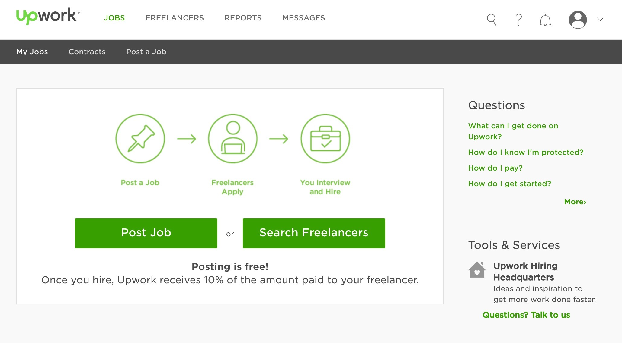
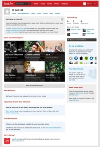
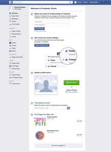
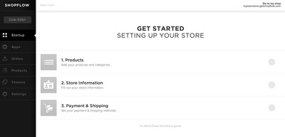
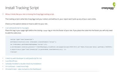
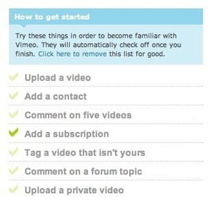
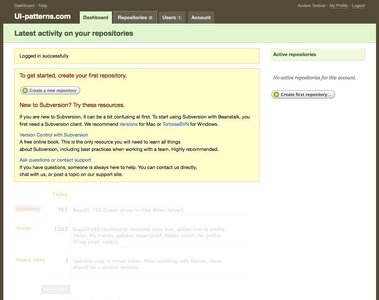
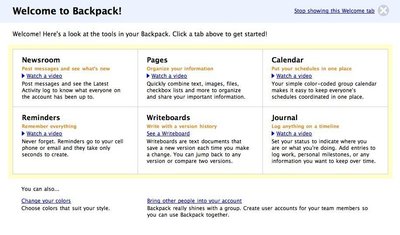
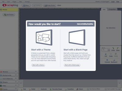
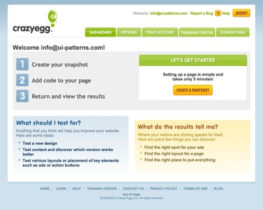
▲ The Blank Slate at UpWork has two purposes: to let users create new freelance jobs or to start searching for freelancers to contact.
Usage
- Use when your application feels without life and empty before the user has started to enter data into the system.
- Use when you want to motivate the user to start using the system.
- Use when you want to aid the user in getting started with your web application.
- Use when you want to show best practices of using your web application.
- Use when you want to guide the user to get a good start with your web application.
This card is part of the UI Patterns printed card deck
A collection of 60 User Interface design patterns, presented in a manner easily referenced and used as a brainstorming tool.
Get your deck!More examples
Solution
Comfort, guide, or encourage users when there is no content to show.
Although Blank Slates aren’t typical, they are important opportunities for good design to avoid user disappointment or confusion. Make sure users feel safe and know what to do next when they use your product for the first time or have cleared all content.
Give the user an impression of how the system will look once filled with data – or guide and encourage them to start filling it with data. You can present the user with several kinds of helpful information on a blank slate:
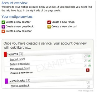
- Show a sample screenshot of how the page will look once filled up with content,
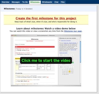
- insert quick tutorials and help texts,
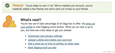
- explain the best ways to get started,
- ask questions the first-time user will ask: What is this? What do I do now?, and
- set expectations to help reduce frustration, intimidation, and overall confusion.
(Source: Getting Real by 37signals)
Rationale
The blank slate is generally the first screen the user is presented with when they start something new in an application. It can the screen they are directed to after creating an account or the first screen they see when using part of an application they haven’t used before. The blank slate tells the user what the page they are on will look like, once it has eventually been filled with content. Creating a blank slate sets the user’s expectations for your service.
New users are often intimidated by empty screens with little or no guidance. Guiding users with a prepopulated starting state is the best way to establish trust and gain understanding.
Make sure the first impression the user gets of your web application is positive. Let them know why they should stick around.
More examples of the Blank Slate pattern See all 69 example screenshots
User Interface Design Patterns
- Forms
- Explaining the process
- Community driven
- Tabs
- Jumping in hierarchy
- Menus
- Content
- Gestures
- Tables
- Formatting data
- Images
- Search
- Reputation
- Social interactions
- Shopping
- Increasing frequency
- Guidance
- Registration
Persuasive Design Patterns
- Loss Aversion
- Other cognitive biases
- Scarcity
- Gameplay design
- Fundamentals of rewards
- Gameplay rewards