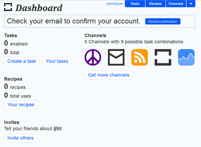
Dashboard
Design Pattern
Alternate titles: Cockpit.
Problem summary
The user wants to digest data from mulitple sources at a glance
Example
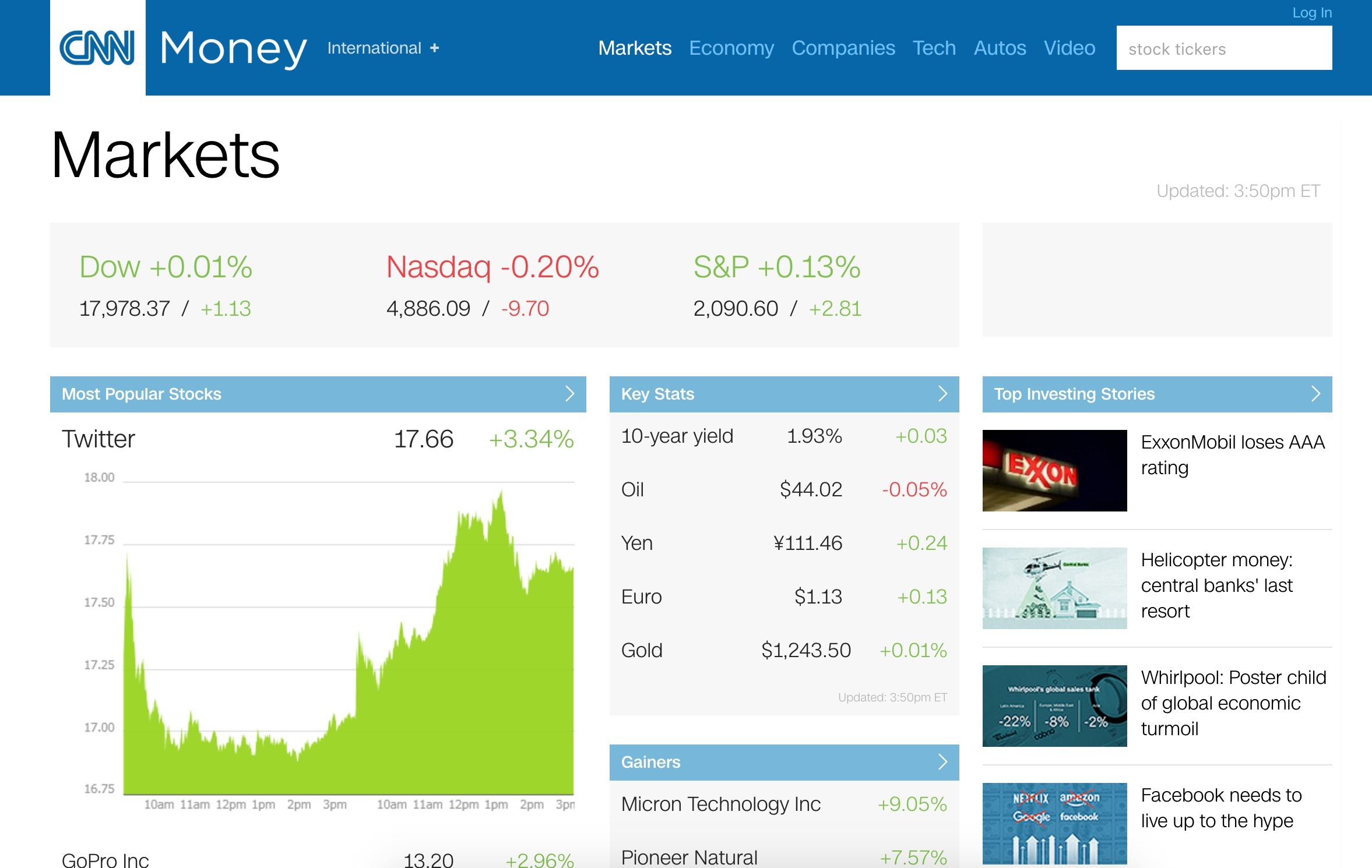
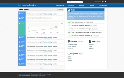
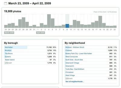
▲ CNN Money groups related data together into their dashboard to establish connections between multiple data points. All data is related around the title and linked via subtitles.
Usage
- Use when you want to provide a high-level overview of data that allows to discover actionable trends
This card is part of the UI Patterns printed card deck
A collection of 60 User Interface design patterns, presented in a manner easily referenced and used as a brainstorming tool.
Get your deck!More examples

Solution
Provide real-time insight into the current state of the most important metrics of a system.
Design the dashboard around a single goal and ruthlessly prioritize the data you put into it around that goal.
Types of dashboards
There are 3 common types of dashboard, each designed for its own specific purpose.
- Operational Dashboards. Displays data that facilitates the day to day operations of a business. Common objectives could be to monitor server uptime, daily sales, daily calls made, or appointments booked. Operational dashboards become the heart of your business and often require real-time or near real-time data.
- Strategic and Executive Dashboards. Displays important KPIs (Key Performance Indicators), which executive teams track on a periodic basis – daily, weekly, or monthly. The strategic dashboard focuses on providing a high-level overview of the state of the business and addresses the core changes the business work to create. Examples of common KPIs could be revenue (compared to prior period), costs (compared to prior period), sales pipeline, etc.
- Analytical Dashboards. Displays either operational or strategic data – or both. The analytical dashboard will offer drill-down functionality, allowing users to explore data in greater details.
Some types of users might need either one of these kind of dashboards, or even two. When possible, try to separate dashboards into multiple views, each with their own purpose.
Rationale
Enable users to make instantaneous and informed decisions at a glance by letting them monitor the major functions of a system efficiently. Indicate what items require urgent attention at the top and move less critical statistics to the bottom. A good dashboard is simple, communicates well, has a minimum of distractions, tries not to confuse, and presents information visually so it is easily perceived.
More examples of the Dashboard pattern See all 6 example screenshots
User Interface Design Patterns
- Forms
- Explaining the process
- Community driven
- Tabs
- Jumping in hierarchy
- Menus
- Content
- Gestures
- Tables
- Formatting data
- Images
- Search
- Reputation
- Social interactions
- Shopping
- Increasing frequency
- Guidance
- Registration
Persuasive Design Patterns
- Loss Aversion
- Other cognitive biases
- Scarcity
- Gameplay design
- Fundamentals of rewards
- Gameplay rewards