Search Filters
Design Pattern
Alternate titles: Live Filters, Refining Search.
Problem summary
The users needs to conduct a search using contextual filters that narrow the search results.
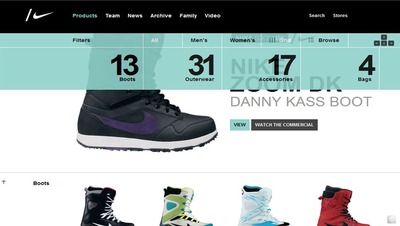
Example
Usage
- Use when the search results for a query are very numerous and reviewing them would be very time consuming.
- Use when search results can be categorized into filters: the search must be contextual.
- Do not use when your search is not easily categorized into filters.
Solution
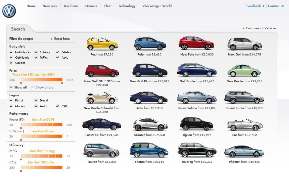
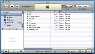
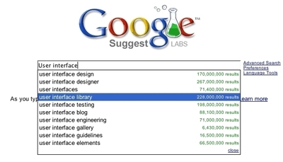
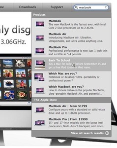
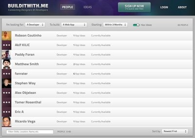
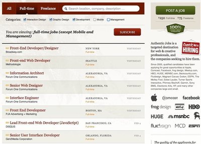
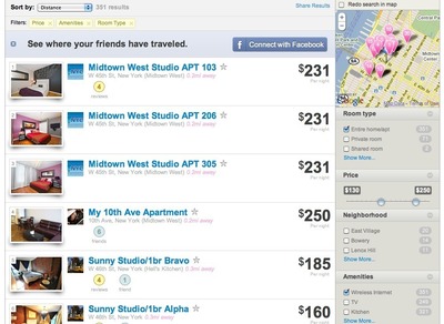
Refine search results in real time using one or more filters.
Present everything available, and then encourage the user to progressively remove what they do not need by applying one or more filters. With immediate feedback, the experience is used from a monologue to a conversation. Only use this pattern when it helps simplify the search experience.
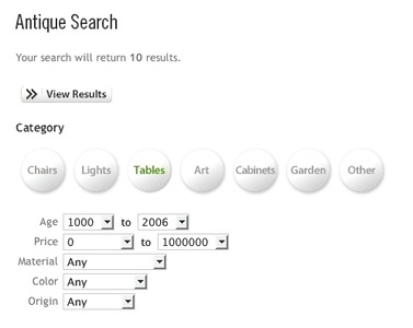
Present the user with a list filter categories, and let the user filter these by inserting input in text boxes, choosing options in dropdown boxes or even through checkboxes or radiobuttons. Whenever the user makes a change to any of the input fields, the results are automatically updated.
Rationale
With a search, you start off with nothing and potentially end up with nothing. Counter to this approach is filtering, where we present everything available, and then encourage the user to progressively remove what they do not need1. – Pete Forde
Using the live filter pattern moves the search from a monologue to a conversation. The user can progressively remove what they don’t need step by step and receive feedback immediately.
When you weigh your decision to use this filter, consider whether the pattern complicates or simplifies search. If it does anything else than simplify finding the correct search result, choose another solution.
1 Live Filter by Pete Forde
More examples of the Search Filters pattern See all 10 example screenshots
User Interface Design Patterns
- Forms
- Explaining the process
- Community driven
- Tabs
- Jumping in hierarchy
- Menus
- Content
- Gestures
- Tables
- Formatting data
- Images
- Search
- Reputation
- Social interactions
- Shopping
- Increasing frequency
- Guidance
- Registration
Persuasive Design Patterns
- Loss Aversion
- Other cognitive biases
- Scarcity
- Gameplay design
- Fundamentals of rewards
- Gameplay rewards

15 comments
Nicolas on Feb 01, 2008
Piece of shit. You claim to give UI patterns, and then you talk ONLY about web apps???
Gary Bartos on Feb 01, 2008
Nicely done, Anders! As a designer/developer of desktop-bound apps, and as someone who has studied design in depth, I will counter the previous comment by claiming that any good designer can see value even if some UI patterns are specific to the web.
Sometimes all a designer needs is an inspiration from a few sentences and screenshots. A site like yours makes this possible, and I consider the site a valuable resource.
For a general review of design, I recommend the book Universal Principles of Design by Lidwell, Holden, and Butler.
racerx on Feb 01, 2008
I love this site. Programmers often have a hard time understanding that their skills in UI stink and the users of there sites would agree. What good is your site if it is unclear how use it?
The Checker on Feb 01, 2008
Good points. One thing though, you need to spell check your copy. Even at the top of your home page, “It has long been common practise to use recurring[…]” — “practice” is misspelled.
Jeremy Gugenheim on Feb 02, 2008
Nicolas simply proves that this is a useful site. We have one set of eyes and we see the whole world through them. All UIs should conform to our views of the world. Intuition, comfort, whatever skill we use to navigate an application, we can only use if the application is navigable. For most people it is comfort. Developers may use intuition but only because we use this stuff every day. Which is one reason I got out of development – it is full of people who know that their way is the only way. Tosh. Utter tosh. Since when has a web site not been an application? Think about it – an ATM is an application, but it behaves a lot like a web site. a kettle is an application but doesn’t behave anything like a web site. Amazon is a web site but behaves like an application. And they all require a UI. Good on you Anders, I look forward to seeing your site flourish – I’m dropping a bookmark here. Thanks.
greenmoss on Mar 01, 2008
Thank you for the inspiration.
James Kelway on Mar 01, 2008
Hi Anders. Great to see this site and it does fill some gaps already. Keep up the good work as sites like this and welie.com are too few and far between. Cheers
Robert on Mar 11, 2008
There is no ‘visit’ function on the links of the UI Design patterns list. How do i know witch one i have seen?
Anders Toxboe on Mar 11, 2008
Robert: Good point – I just added more correct link styling to cope for this.
Janko on Mar 26, 2008
Good site. No matter what anyone thinks, I appreciate your efforts.
P.S. RSS feeds would be nice :)
Antonio on Mar 26, 2008
I like this site. ¡Congratulations!
How can someone contribute?
BerGriern on Mar 27, 2008
Snx for you job!
It has very much helped me!
Kevin Jensen on Apr 04, 2008
Site is great but RSS feeds are necessary.
Scott on Apr 10, 2008
Great site! Very useful!
Adarsh on Sep 21, 2010
I think its good explanation. I have worked on both winforms and web apps and I feel it gives a lot of insight as to how to implement the pattern.
Whether explained for web appp or winforms does not matter.I need the concept.
Comments have been closed