Good Defaults
Design Pattern
Problem summary
The user needs to enter data into the system, where some input values are most likely to match default values.
Example

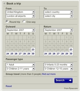
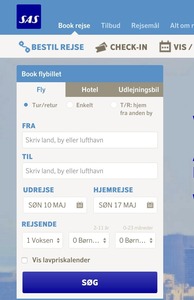
▲ A typical use of the Good Defaults design pattern is at travel sites. Here, data like dates, trip type, and price range is pre-selected to what most other users typically select. Good Defaults provide ease of use and a quick start to searching for your next trip.
Usage
- Use when the user has to choose among many options, where some are most likely to match the default values chosen by other users.
- Use when it is possible for the system to make qualified guesses regarding what the user might choose.
- Use when it seems a complicated task to fill out the form without the default: when the number of required choices hinders the user from finishing filling out a form.
- Do not use for input fields that are important for the user to think about. For instance for signing up to a newsletter or accepting the terms and agreements of a website.
This card is part of the UI Patterns printed card deck
A collection of 60 User Interface design patterns, presented in a manner easily referenced and used as a brainstorming tool.
Get your deck!Solution
Pre-fill form fields with best guesses at what the user wants.
Drop down boxes and text fields are prefilled or preselected with reasonable default values. The default values are intelligent guesses as to what the user would possibly select.
When appropriate, reduce the cognitive load on users by pre-filling forms with default values. Use contextual information to make intelligent guesses as to what the user would most likely select. Do so only when you are reasonably sure your users would agree with your default values – otherwise, you will create extra work. Pre-filling controls to your own benefit rather than your users’ will most often backfire.
Rationale
By providing default values in often complex forms with many choices, you save the user from the hassle of selecting all the relevant choices. Filling out a long form can sometimes be enough reason for the user to go somewhere else, where the process is easier.
The default values might not be right, but at least you provided the user with an example that he can change with as much effort as he would have put in if there was no example.
More examples of the Good Defaults pattern See all 8 example screenshots
User Interface Design Patterns
- Forms
- Explaining the process
- Community driven
- Tabs
- Jumping in hierarchy
- Menus
- Content
- Gestures
- Tables
- Formatting data
- Images
- Search
- Reputation
- Social interactions
- Shopping
- Increasing frequency
- Guidance
- Registration
Persuasive Design Patterns
- Loss Aversion
- Other cognitive biases
- Scarcity
- Gameplay design
- Fundamentals of rewards
- Gameplay rewards



2 comments
Dorian L. Bachmann on Nov 14, 2009
Sometimes is better not leave default values in order to be safe that the user took the decision. This situation occurs when you really need the collected data be realible.
neil taylor on Mar 15, 2011
I would prefer to see “suggested values” (such as “Select Country” and “Select City”) to be in a lighter shade of gray than the “default values”
I think it is also worth noting that inputs containing “suggested values” and “default values” should be cleared when they receive focus.
Inputs containing “suggested Values” should (probably) be restored upon blur if the value is empty.
Comments have been closed