Account Registration
Design Pattern
Alternate titles: Sign up wall, Sign-In Wall, User Sign-Up.
Problem summary
You wish to know who the active user is in order to provide personalized content or opportunities to conduct a purchase.
Example
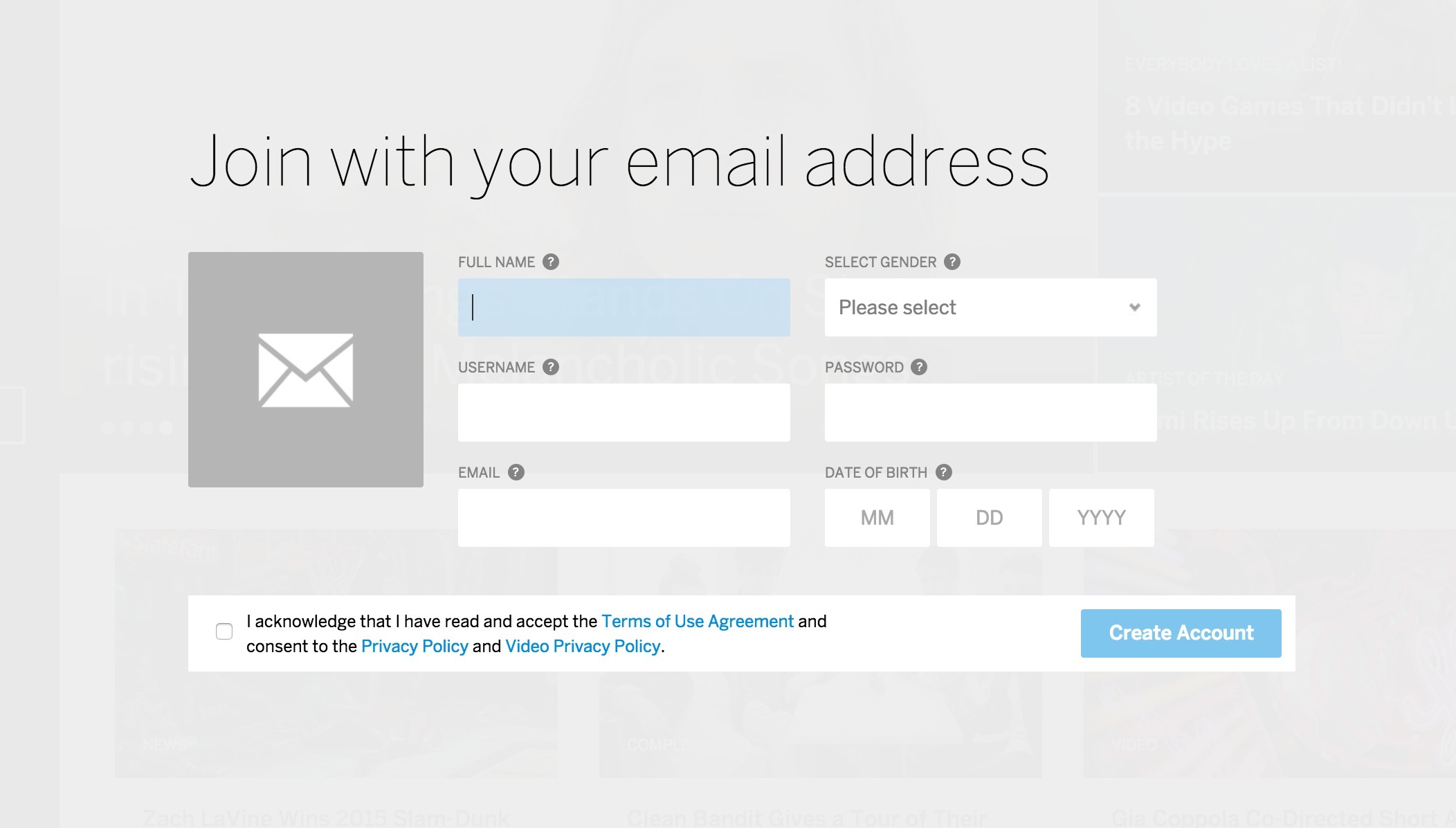
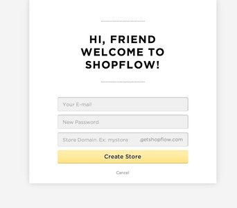
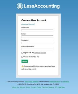
▲ When you choose to sign up with your email (and not another social service) at MySpace.com, this is how the sign up form looks like.
Usage
- Use when you want to restrict access to certain content.
- Use when you want to control which users have access to content.
- Use when contextual information must be presented to the user. The context can depend on the user’s geography, timezone, age, interests, or even the user’s prior interactions with your site (friends added, submitted content, etc.)
- Use when you want to protect your user’s information.
This card is part of the UI Patterns printed card deck
A collection of 60 User Interface design patterns, presented in a manner easily referenced and used as a brainstorming tool.
Get your deck!More examples

Solution
Ask users to register an account in order to provide a personalized experience. Let users register an account to allow saving information with your service, provide a personalized experienced, or give access to limited resources.
Common design flaws for registration and sign-in features include:
- Visibility: make sure the “Sign-in” and “Sign-Up” buttons” are clear, easy to see and easy to access. Don’t hide the “Sign-in” button/form.
- Call to Action: Draw attention to crucial operations such as “Register new account” “Sign-in”, and “I forgot my password”. Ensure your action buttons are appealing and encourage new users to join.
- Nudge: Exploit sign-up opportunity at key locations, don’t just rely on one point of action.
- Redundancy: Provide plenty of “Sign-In” buttons at key locations. Users often wait to the last moment to sign in. Key locations are points of action; for instance when the user wants to add a comment to a blog post.
- Complicated: Don’t frustrate users with complicated password requirements. The strength of the password you require needs to match the need for protection. A password policy that is too strict can hinder sign-up and may discourage potential customers.
You can make your account registration easier on your users including:
- Provide a simple and understandable description of the requirements for usernames and passwords.
- Additionally, you might want to provide a password strength meter to provide instant feedback on how well the entered password meets the requirements instead of displaying an error message after the user has clicked the submit button.
- Similarly, you might also want to use AJAX to check for the availability of the username on every keystroke, so that the user does not need to submit the entire form several times before he is allowed entrance.
- When logging in, return to the page the user came from. If the point of action was submitting a comment to a blog post, redirect the user to the comment form after login.
- Consider incorporating a social sign in options such as “Facebook Login” into your website/application and avoid the entire new password paradigm entirely.
Rationale
Account registration enables personalized and contextual content to be presented to authenticated users.
Account registration allows for remembering details about the user; product wish lists, preferences, interests, shipping and billing addresses, VAT number for billing purposes, and more.
Benefits of letting the users register an account with your site include:
- You know who is using your system
- You know how often they visit
- You know what they do on your site.
- You can store information your users might need later, such as billing info or wish lists for future purchases.
- You can use account registration to reserve special content from your regular users.
- You can differentiate prices, information displayed, and access rights depending on who the logged in user is.
Discussion
Is account registration necessary? And when?
Customers do not like to identify themselves until they actually need to. They need to when he or she has decided take action – for instance to purchase a product. Until then, you do not want to block users from taking action or browsing your website. In general, you will only want to protect the pages that actually requires you to know the user’s identity. Users hate having to register an account to do something simple. An example of premature sign-in would be forcing users to sign in before they can browse your online shop’s products. User’s want to get an idea of what is offered before they commit to creating an account, not the other way round.
What kind of site do you run? Is it really necessary to develop a relationship with your customers (or users) or is the typical behavior of your kind of customers to stay anonymous? In the latter case, you might want to consider not requiring an account registration at all – even when the user is purchasing a product.
Why should the user register?
You need to clearly state what benefits the user will get from registering an account with your website as this step is a burden for the user. One way to do this is to directly communicate the benefits in written sentences such as “Track your order”, “Change your reservation at a later time”, or “Receive our newsletter” (Yes, this actually is a benefit to some people).
Another way to communicate the benefits of registering an account is to block points of action. Examples of this are submitting a comment or content to the site.
Asking too many (unnecessary) questions
Knowing your users is important, but wanting to know them too well can hinder account registration. Even though your marketing department is eager to know the exact interests, phone number, or even size of yearly paycheck of your users, asking them this is not always a good idea. With spam e-mails being a common known phenomenon, the average internet user is reluctant to trust you with such data.
In certain cases you may require personal information from users, to maintain trust, declare exactly why you need it. A simple “In case we need to contact you, please provide a phone number” will do.
Making up a user name and thinking of a new password are big tasks for the user already. The fact that the user needs to think and make up their mind about these things means it has taken away the user’s focus from the task he or she had at hand.
More examples of the Account Registration pattern See all 206 example screenshots
User Interface Design Patterns
- Forms
- Explaining the process
- Community driven
- Tabs
- Jumping in hierarchy
- Menus
- Content
- Gestures
- Tables
- Formatting data
- Images
- Search
- Reputation
- Social interactions
- Shopping
- Increasing frequency
- Guidance
- Registration
Persuasive Design Patterns
- Loss Aversion
- Other cognitive biases
- Scarcity
- Gameplay design
- Fundamentals of rewards
- Gameplay rewards
5 comments
Jasper Kennis on Mar 20, 2008
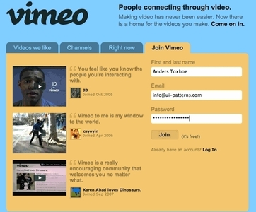
Good method, but you shouldn’t ask to much information at the moment a user is subscribing, for at that moment he probably wants to make use of a service. You can ask for more info later on. The yahoo account registration method is therefor less efficient than vimeo way of doing it.
Jony on May 24, 2008
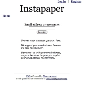
E-mail address should not be required if it is not necessary. The best way to solve forgotten passwords problem is to use e-mail as an option. Moreover it is much better when user can decide to get notifications via IM.
Web 2.0 Design on Aug 28, 2009
Clearly, asking for too much information may not be the best way around
SOLOMON on Jan 26, 2010
I WANT TO HAVE MY OWN WEBSITE
Abhay Agrawal on Feb 24, 2012
Unnecessary Questions are a real headache for a user who is filling up a registration form as he/she is already thinking about lots of things to be filled in that form but in the mean while he/she has to think for these CRAPS.
Comments have been closed