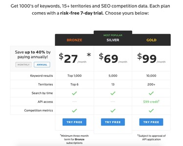
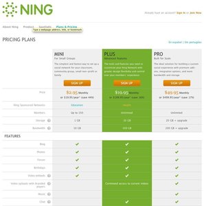
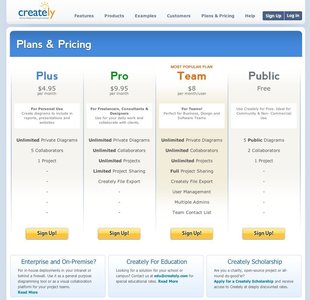
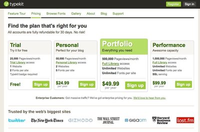
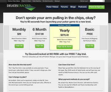
Pricing table
Design Pattern
Problem summary
The user needs to get an overview of what pricing plans are offered and how they differ
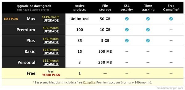
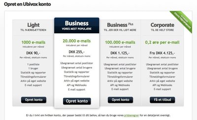
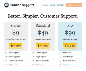
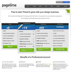
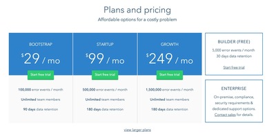
Example
Usage
- Use when there is more than one version of a product to choose among
- Use when you want to provide the user with an overview of how versions of products differ both in terms of features and price
- Do not use when the user can possibly buy more than one product at a time
- Do not use when the user can possibly decide what products he or she wishes to buy in one session, and return later to conduct the actual payment
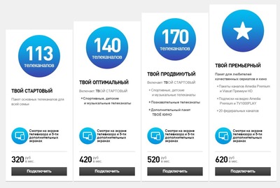
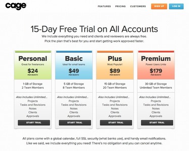
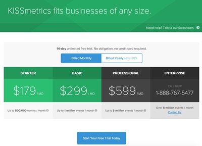
More examples
Solution
Pricing tables are used as a way to illustrate how features of a product differ as the price changes.
Display the different version of a product in a table aligning price and features for comparison.
A list of the most frequently asked questions (FAQ) regarding the product is often listed directly below the pricing table. These often address issues that potential customers typically worry about: how does the free plan work, is there a money-back-guarantee, how will I be billed, etc.
It is a very common part of Application Service Providers (ASPs) marketing websites. In the most cases, these only have one major product to offer, but offers this product in different variants (plans). On these kind of websites, the price is most often based on a monthly/quarterly/yearly subscription plan.
When you create your pricing table, it is good to consider the following points:
- Visually separate plans by using alternating background colors. When used sparingly, you can attract attention the plan you want the user to buy.
- Utilize different font sizes and colors for elements you want to stand out: titles, prices, headlines, etc.
- Be aware that users scroll down long tables. Prices at the top of a table might not be visible when they’ve reached the bottom. One solution is to place prices both at the top and bottom – another is to keep the pricing table short.
Rationale
Converting interested visitors into paying customers is your biggest aim. Use pricing tables to illustrate what your product is capable of in full bloom and at the same time to lure them in.
Discussion
There are several factors you can tweak to increase conversion. The following are techniques and patterns observed in use.
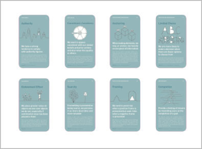
Apply hooks
Hooks are what defines the differences between the plans offered – the factors that will trigger the user to need an upgrade or force them from downgrading. Hooks [for website plans] are most often defined by of these 4 parameters:
- Features
More expensive plans offer features not available in cheaper plans. - Resources used
Maximum levels in different categories (e.g. file storage used, number of posts, amount of projects) can be defined to push the user into upgrading as these parameters grow as the user continuously uses the system. Unlike the traffic parameter listed below, these are options, which the user can do something about: Uploaded files can be deleted to lower used file storage and old posts can be deleted to make room for new posts. - Resources consumed
Where Resources used is defined in absolute values, Resources consumed is different as it is defined by absolute values per time unit. For instance by number of posts by users or user visits (hits) per month. Resources consumed can also be defined as traffic. The user cannot do much about the traffic his service experiences as this is defined by the popularity of the service the user has bought (for instance a blog, a webcounter, or a forum). Traffic is defined by the usage of the user’s visitors. Defining plans with this parameter can be tricky, as you need an alternative to fall back on, if the user does not wish to upgrade to the plan his traffic demands. Services with plans involving this parameter often have ad-supported versions to make up for users that do not wish to upgrade. The user is everything: we do not want to loose him or her. - Number of services
A fourth parameter is the number of services allowed. For instance the amount of projects, blogs, or forums offered to each account.
Highlight why users should pay for your product
If price is the main parameter you’re competing on, highlight it. Make the price big. If not, soften the pricing and put more focus on the benefits and the features.
If your case is the latter, chances are that your users will spend the least amount of money they can get away with – at least to start with.
First one free
Most subscription services at ASPs have free plans. Can you give something away, which gets people interested or even addicted, so they come back and possibly pay for more? In more humane terms: offer a way for people to play around with your product or use it in order for them to decide if the full fledged product is worth buying.
Order plans by descending price
If you order your plans by the cheapest plan first, chances are that users will stop looking at the benefits of the more expensive plans as they’ve reached their preferred pricing level.
Because we read from left to right, users won’t be able to ignore your high-end plan if you place them in order of descending price – the most expensive in the left and the cheapest on the right. Users are more likely to ignore higher pricing plans and only consider cheaper ones if you list the cheapest plan to the left.
Add decoys
Can you add “decoy” choices, making the others (which you want people to pick) look better in comparison? Add a decoy to remove focus from your actual highest pricing plan.
The Goldilocks effect: We are aversive toward extremes
So you don’t need actual decoys – still, you should consider the fact that we are aversive toward extremes. [Provide] a premium as well as a budget option alongside a regularly priced product to make the latter seem more appealing3.
If you are selling a small and a large plan, you might want to add a middle plan in order to push people usually buying the cheapest into buying a more expensive plan.
This method is a way of exploiting our psychological biases and manipulating us into choosing the option that yields greater profit – often placed centrally within the pricing range.
Let people know what they’re missing
Fade out or strike-through things not available on lower plans to give users a feeling of not having a full product – in order to play on our inept urge for closure and completeness.
Showcase differences with extremes
Quantify features into extremes to let differences between plans seem extreme. “Unlimited users” next to “10 users” might appear as an extreme difference, but might not be that big a deal if the average user count per account is around 10-15.
1 7 Useful Design Strategies for a Successful Pricing Table at uxmovement.com
2 Decoys by Dan Lockton at Design with Intent
3 Persuasive purchase behaviour – Understanding the power of the Goldilocks Effect by Paul Seys form shortboredsurfer.com
More examples of the Pricing table pattern See all 196 example screenshots
User Interface Design Patterns
- Forms
- Explaining the process
- Community driven
- Tabs
- Jumping in hierarchy
- Menus
- Content
- Gestures
- Tables
- Formatting data
- Images
- Search
- Reputation
- Social interactions
- Shopping
- Increasing frequency
- Guidance
- Registration
Persuasive Design Patterns
- Loss Aversion
- Other cognitive biases
- Scarcity
- Gameplay design
- Fundamentals of rewards
- Gameplay rewards
2 comments
Ashit Vora on Oct 26, 2010
Just curious, is it a good idea to highlight price in bold?
That’s the second most important thing. isn’t it?
First most important thing to highlight is features that users will get when he select that specific plan.
Anders Toxboe on Oct 26, 2010
@Ashit Vora: It really depends on what parameter you’re competing. If you’ve got the best product, then I would highlight the features and why your product is better than the competition. If you’re competing on price, then make that the biggest eye-catcher and use the features to explain why you’re “just as good” as more expensive alternatives.
Comments have been closed