Adaptable View
Design Pattern
Problem summary
You want to let the site's presentation of content fit the specific needs of the user.
Example
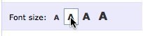
▲ Increase the font size on the page.
Usage
- Use when a considerable part portion of your potential users have specific technical needs concerning how content is presented. Examples are mobile browsers, small screen resolutions, and monochrome monitors.
- Use when a considerable part of your potential users have specific needs to regarding accessibility and how content is presented due to disability. Examples are colour-blindness or poor vision.
- Use when your users need to control font size but may not know how to use the browser’s built in font resizing settings.
- Use when you want to give users the ability to switch between from a mobile version of a site to the full featured version. It is for instance not all iPhone users who actually like to use tailored iPhone versions of websites instead of the full-featured browser version.
More examples
Solution
Provide a mechanism to switch or alter the default style of a page so that it fits the specific needs of the user.
When catering to alternative browsers such as mobile phone browsers, the view to present can often be found looking at the incoming user agent. In this case, a manual mechanism to switch styles might seem obsolete, but it is good practice to allow access to all views of a site regardless of how the user is browsing it.
Provide a manual control to allow users to switch/alter the default style of a page so that it better fits their specific needs. It is for instance not all iPhone users who actually like to use tailored iPhone versions of websites instead of the full-featured browser version.
It is a good practice to allow for permanence of the user’s preferred configuration. This will prevent the user from having to make the same adjustment each time a page reloads.
Rationale
By providing a mechanism to present different views of content to the user, you can tailor usability and the experience you want to give your users to their specific needs.
Discussion
At first it may seem that a style adjuster is a superfluous feature that falls one step short of showing off. After all, don’t users already have control over the presentation of content through the means of user stylesheets and the browser’s built in font resizing? Well, just because a user has the ability to use these tools, doesn’t mean that they have the knowledge or willingness to get their hands dirty with them.
Enter the on page adjustable style control. It can give a web designer the ability to extend a browser’s accessibility support and provide them in a much more convenient way.
Beyond accessibility concerns, style adjusters can also cure some of the common annoyances that almost everyone deals with. One example of this is when a site forces a user to use the mobile version. A simple button that switches the site to the full featured version is enough to alleviate the feeling of being trapped.
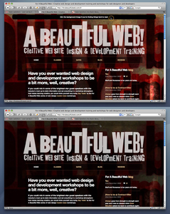
More examples of the Adaptable View pattern See all 4 example screenshots
User Interface Design Patterns
- Forms
- Explaining the process
- Community driven
- Tabs
- Jumping in hierarchy
- Menus
- Content
- Gestures
- Tables
- Formatting data
- Images
- Search
- Reputation
- Social interactions
- Shopping
- Increasing frequency
- Guidance
- Registration
Persuasive Design Patterns
- Loss Aversion
- Other cognitive biases
- Scarcity
- Gameplay design
- Fundamentals of rewards
- Gameplay rewards
7 comments
Jim on Jan 14, 2009
Personally I think this should be limited to text changes (font size) or switching between interfaces (e.g. mobile/desktop). Things like hiding website elements add an unnecessary degree of complexity to user experience.
Andrey on Jun 01, 2009
I think home page should contain adverts and big logos, rather then every page in collapsable header.
Tracey on Jun 17, 2009
Also, another usability issue, your site branding will not longer be prominent and your users may forget what site they are on, much less the name of it. Site banding MUST be visable at all times. Collapsable header causes confusion.
Andrea Kendall on Nov 14, 2009
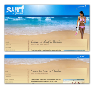
To address the concerns about branding two versions of a header could exist. One would be the full header as shown in the first picture. The second could just contain the logo and enough information so that user knows where they are.
This proposed solution mainly works well where the top portion has more than eye candy so that there is a good reason for wanting it available on every page.
If the majority of the hidden area was just eye candy I would go with the solution where it was just shown on the first page.
yardbird on Mar 24, 2011
ADA compliance is an excellent reason for using this approach when you just can’t bring yourself to provide it in your primary design.
Of course, the affected user has to easily find the feature that makes the site more usable for their needs.
@YoDK on Aug 02, 2011
The user should not be concerned with modifying the layout of the webpage to fit their needs.
The presentation of the content should be designed to be responsive to the user.
A great example is getsatisfaction.com. The content adjust itself to the viewable area. Resize the browser and see for yourself.
Showing the right content is a different matter all together. It’s really the only thing that matters.
A beautifully designed UI with terrible UX is useless.
jeremy on Jan 31, 2012
Where can I download this code? I’d like to play around with it as an option to show/hide the footer sitemap.
Comments have been closed