Calendar Picker
Design Pattern
Alternate titles: Date picker, Date selector.
Problem summary
The user wants to find or submit information based on a date or date range
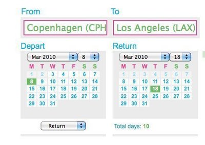
Example
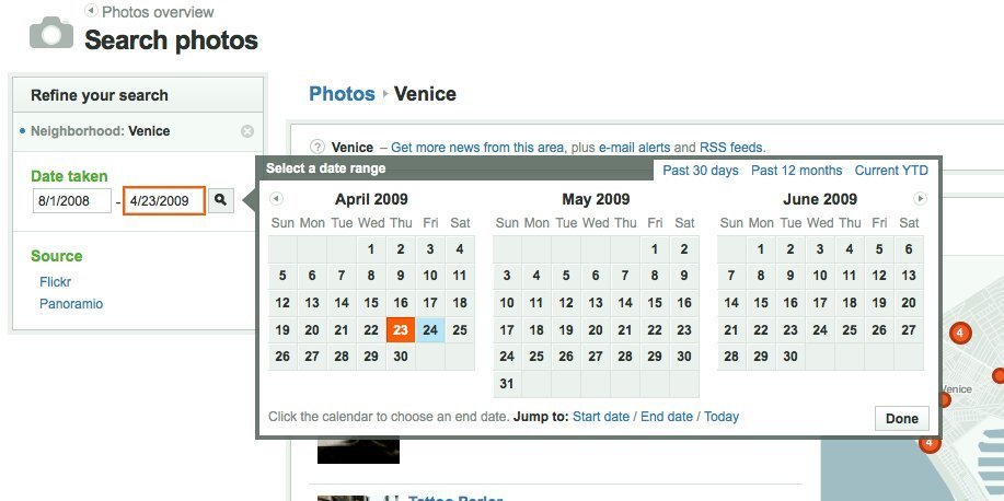
▲ Beautiful calendar date selector at everyblock.com.
Usage
- Use when the user wants to easily choose a date or date range in order to submit, track, sort, or filter data.
- Do not use in isolation, when the user is more familiar and efficient with another way of inputting a date. Some users prefer inputting a date via a text field.
- Do not use when the date to be inputted is more easily inputted via writing the date as text – an example is birthday (18, 30, 50, or 70 years back – requires many clicks for selection)
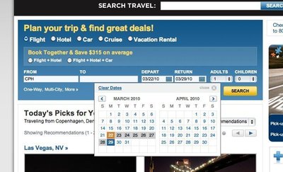
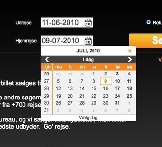
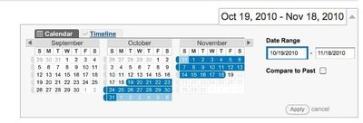
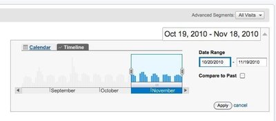
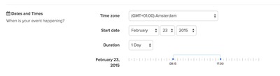
More examples
Solution
The calendar picker is activated in a variety of ways:
- When clicking a link prompting for selecting a date
- When selecting an field for inputting a date
- When clicking a calendar icon most often placed next to the field used for inputting a date
On activation, a box with a month-calendar is displayed on the current page, prompting the user to select a date in the box. It is most common to only show one month, but some interfaces show up to 3 month calendars next to each other to ease the click-burden of the user and provide a better overview.
Shortcuts
The month-box calendar comes with several different shortcuts:
- Select a date
- Go to the previous/next month
- Go to the previous/next year
- Go to today (Especially important when today’s date is not the default)
- Close the calendar picker
Locking-in the period of selection
For some interfaces, it makes sense to not allow the selection of certain dates. An example often used is to only make it possible to select banking days, days in the future, or days within the few forthcoming months.
Two ways of inputting data: speedy and easy
When designing for efficiency in web application, an area that often gets little attention is the contexts of input. On most desktop computers the most common way of inputting data is via keyboard or mouse. On mobile devices touch, keyboard and camera are the most common input methods.
Using a calendar picker is an easy way of inputting a date. But also consider a quick and effortless way to input a date – one were the user does not need to switch between input devices but can rather accomplish their task with a single input device.
For accommodating text inputs, consider using the Forgiving Format pattern to lessen input errors.
Good defaults
Use the Good defaults pattern to achiee better data and spelling accuracy on input by pre-selecting appropriate dates.
The defaults you pre-select will depend on the context but will most often be the current date or time. However, If you were designing a public transport route planner, you might default the start time to a half hour from now, as most travellers won’t be starting their journey right away when searching for a fare.
Check date range validity
If the user is selecting a date range, it is good practice to never let end-date be before the start date. That means listening to the start-date for changes and changing the end-date if the start date is set to anything bigger.
Display complete weeks
Display complete weeks, even when a month does not begin at the end of the week. Grey out visible dates from previous and next months, but be sure they are still selectable.
Make link targets big
Make sure that link targets are big and thus easy to click on.
Rationale
The calendar picker is a familiar graphical interface that is commonly understood among users. It helps the user easily choose a date or date range for use in submitting information or filtering data.
Discussion
International considerations
In some countries it is typical to display a calendar with Sunday as the first day of the week, where in many European and Asian countries, Monday is typically depicted as the first day of the week.
Some countries (E.g. Germany and Scandinavian countries) use week numbers for general planning purposes. In these countries, using the week number is almost as common as using the month name for describing a date range. Consider displaying the week number for each week row.
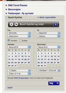
More examples of the Calendar Picker pattern See all 8 example screenshots
User Interface Design Patterns
- Forms
- Explaining the process
- Community driven
- Tabs
- Jumping in hierarchy
- Menus
- Content
- Gestures
- Tables
- Formatting data
- Images
- Search
- Reputation
- Social interactions
- Shopping
- Increasing frequency
- Guidance
- Registration
Persuasive Design Patterns
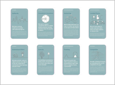
- Loss Aversion
- Other cognitive biases
- Scarcity
- Gameplay design
- Fundamentals of rewards
- Gameplay rewards
5 comments
Azeroth on Mar 02, 2010
What about time? What if you need to pick date and time – could you do it in the same dropdown dialog or is it recommended to use separate input fields for date and time?
Ivan on Sep 27, 2010
I would also like to see a UI pattern for time.
I’ve seen them done in numerous ways, but I believe the easiest pay be 3 select lists: One for hour, minute, and AM/PM.
DG on Feb 10, 2012
“Do not use in isolation, when the user is more familiar and efficient with another way of inputting a date. Some users prefer inputting a date via a text field.”
This is the problem I am facing. How do you decide on a universal date format in the text field? People in the UK or Asia might not be comfortable with the MM/DD/YYYY format used in the US and vice-versa.
ISO recommends YYYY-MM-DD but how many sites/applications use this?
dperalta on Feb 14, 2012
@DG
IMHO you should probable go for a hybrid solution. Use the Forgiving Format and let them enter the date as they want (it’s easy to distinguish ISO YYYY-MM-DD from the other two) and for the US vs UK dates (DD/MM or MM/DD) do an ‘auto-complete’ that shows a calendar-picker on the dates you are assuming (just choose one of the two as basis).
This way a user can start entering a date as they want and then it either A) matches what they expected and they just move along, or B) it mismatches the pop-up and they correct the text to conform with your assumed format, or C) it mismatches the pop-up and they click on the correct date.
I really think there is no “one way solution” for your problem here…
Gilbert Midonnet on Mar 31, 2012
The key point is that you have to give the user choices:
“Do not use in isolation … Some users prefer inputting a date via a text field.â€
Regarding different notation systems month/day/year versus day/month/year you again have several options. The simplest option would be to show the “proper” format in or below the text entry box.
Comments have been closed