Inline Hints
Design Pattern
Alternate titles: Inline Cues.
Problem summary
The user wants to learn about new or unfamiliar interface features in an unobtrusive way
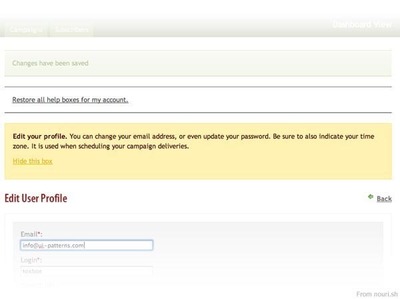
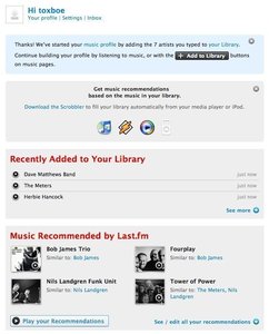
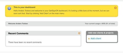
Example
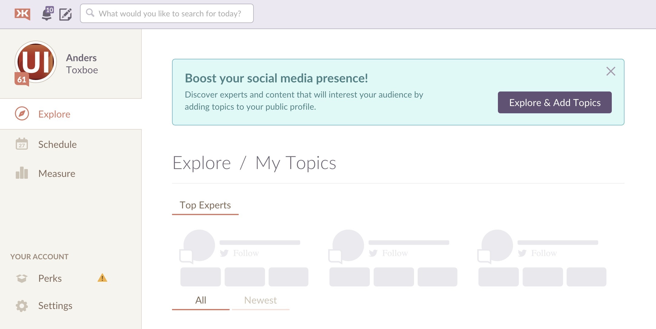
▲ At Klout.com, an Inline Hint is combined with a the Blank Slate design pattern.
Usage
- Use when you want to improve readability of guided help, as Inline Hints are formatted consistent with other content
- Use when you don’t want to interrupt or obscure a content experience
- Use to provide helpful information in combination with Blank Slates
- Do not use when you want to be absolutely sure users have seen your hint, as the subtle appearance that flows the rest of the content is at the risk of being ignored.
- Do not use for conveying mission-critical instructions.
This card is part of the UI Patterns printed card deck
A collection of 60 User Interface design patterns, presented in a manner easily referenced and used as a brainstorming tool.
Get your deck!More examples
Solution
Blend in hints and coaching with content for a seamless experience.
Use the language of the existing layout to seamlessly blend in tips and coaching. The integrated experience of using the shapes of normal and everyday content allows for a more easily readable and relevant form of instruction that doesn’t interrupt or obscure a content experience.
Hints are integrated seamlessly into the layout of surrounding content so that they do not obstruct or interrupt user interaction. Inline hints do not need to be dismissed although they are seen to be dismissible, to disappear after continued use, or, in the case of Blank Slates, when the user populates the screen1.
Do not use this pattern if you want to be absolutely sure users have seen your hint, as the subtle appearance that flows the rest of the content is at the risk of being ignored. Use Inline Hints to reinforce other instructions provided elsewhere in the interface.
As Inline Hints blend in with the rest of the content, users get easily confused if the hint’s information is not relevant to its surrounding content. Do not overuse them; make sure they are relevant and do not overwhelm the primary content experience.
Rationale
By having inline hints take the shape of normal, everyday content, designers hope that they will be more easily readable and relevant than other forms of instruction.
1 Patterns for new user experiences by Krystal Higgins
More examples of the Inline Hints pattern See all 4 example screenshots
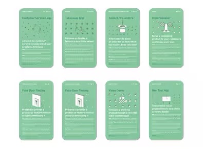
User Interface Design Patterns
- Forms
- Explaining the process
- Community driven
- Tabs
- Jumping in hierarchy
- Menus
- Content
- Gestures
- Tables
- Formatting data
- Images
- Search
- Reputation
- Social interactions
- Shopping
- Increasing frequency
- Guidance
- Registration
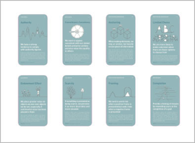
Persuasive Design Patterns
- Loss Aversion
- Other cognitive biases
- Scarcity
- Gameplay design
- Fundamentals of rewards
- Gameplay rewards