Product page
Design Pattern
Problem summary
The user need to know details about a product in order to make a purchase decision or satisfy a need for support.
Example
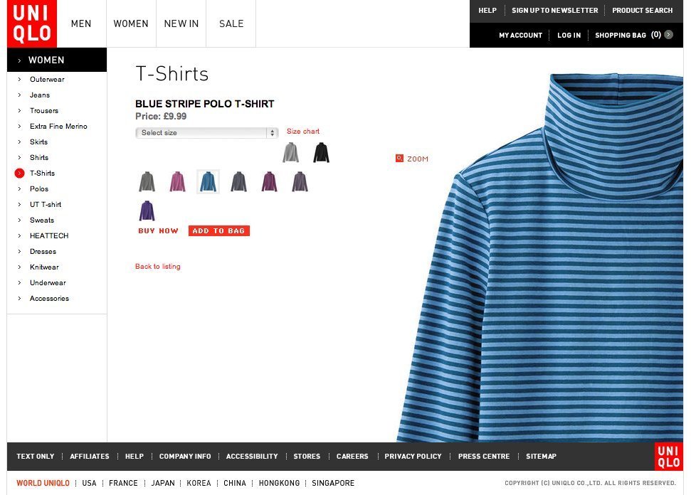
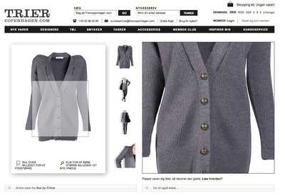
▲ At the uniqlo.co.uk web shop, the product picture acts as a design element of the page, clearly setting the visual priority of elements on the page.
Usage
- Use to display information about a product in a ecommerce site, on a manufacturer / brand website, product comparison website, or other product centric websites.
- Use to display product about a physical product available for purchase.
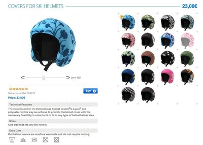
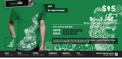
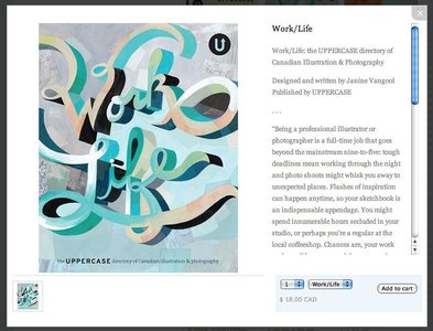
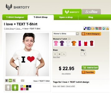
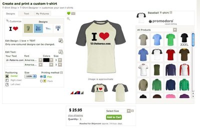
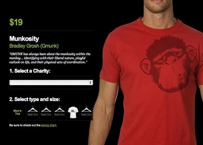
More examples
Solution
Present a given product and group related information into chunks. Optionally provide links to other relevant products.
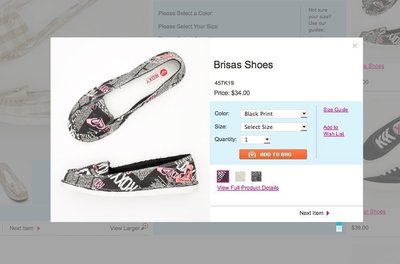
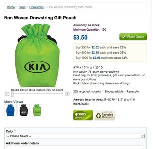
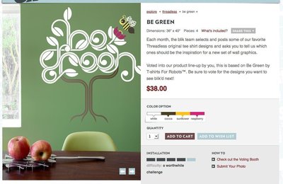
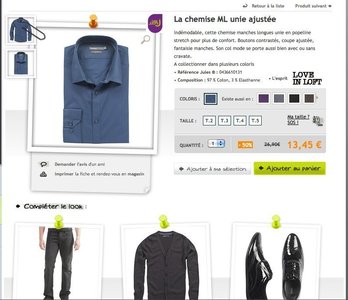
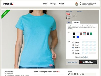
Product pages usually have the following four design elements:
- Product title (product name)
- Main picture of product
- Price
- “Add to cart”, “Place order” or “Buy” button
Furthermore, the following elements are used when they make sense:
- Sales price (often in red and with original price crossed out)
- Detail images
- Product variants (size, color, etc.)
- Product variant pictures (especially regarding color or different patterns)
- Availability (amount in stock)
- Delivery time
- Quantity input form
- “Add to wishlist”/“Favorite” button
- Zoom function
- Short description
- Longer description
- Product specifications/details
- Label (“Bestseller”, “Only few left”, “Recycled materials”, etc.)
- SKU (Stock Keeping Unit) or other form of product id.
- Special offers (Buy this product + another for $xxx,buy 2 for less, etc.)
- Support info – often with phone number or support email address
- “Customize” button
- Share on social media buttons (Facebook, Digg, StumbleUpon, etc.)
Rationale
Converting interested visitors into paying customers is your biggest aim. Design your product pages with the purpose of persuading users to buy one or more of the products you are selling.
Discussion
There are several factors you can tweak to increase conversion. The following are techniques and patterns observed in use:
- Use quality product photos. Photos serve two functions: (1) to set the tone (the web shop knows what it’s doing and it’s a quality place to shop) and (2) customers should be able to see products from every angle and get a feeling of how the quality “feels”.
- Use video. Video can help make up for not being able to “try the product on” and give the user a feel of how the product performs, sounds, looks in function, etc.. One of the things that made ASOS (As Seen On Screen) big was the ability to see catwalk videos of most products.
- User reviews. Allow users to post reviews of products in order to assist customers in their decision process. User contributed product reviews can provide valuable information on which users can base their purchase decisions on. They are especially popular among retailers and travel companies. User reviews help provide social proof of the product.
- Expert opinions. Expert opinions about the product can help persuade the user into buying that exact product. However, there is a considerable possibility that the user will feel like it’s a paid sales pitch. Use expert opinions with caution – they most often work with product gurus or when the opinion was published in an independent and credible publication.
- Present related products. Amazon’s popular “Users who bought this also bought” function is the most known. Other web shops rely on building up relations between products manually or simply fall back to listing products from the same category.
- Reinforce customer trust. Use trust indicators like badges of secure payment gateways that everybody knows. Brands like PayPal or VeriSign convey a sense of security and put most doubts about data theft and security to rest. Credit card icons also provide a great a sense of comfort. A credit card form without credit card icons feels wrong. Other trust indicators are the brand names (and their logos) you sell, money back guarantees, industry standards or ratings.
- Prioritize important information and avoid hide-and-seek. Don’t make it hard for people to find what they’re looking for. There is no salesperson to answer questions online, so don’t make it hard for people to find the answer themselves.
1 Product Page design pattern at welie.com by Martin van Welie
2 10 tips on ‘product page’ design in time for Christmas’ at econsultancy.com
3 Design for trust by Anders Toxboe on UI-patterns.com
4 What people see before they buy from cxpartners.co.uk
More examples of the Product page pattern See all 45 example screenshots
User Interface Design Patterns
- Forms
- Explaining the process
- Community driven
- Tabs
- Jumping in hierarchy
- Menus
- Content
- Gestures
- Tables
- Formatting data
- Images
- Search
- Reputation
- Social interactions
- Shopping
- Increasing frequency
- Guidance
- Registration
Persuasive Design Patterns
- Loss Aversion
- Other cognitive biases
- Scarcity
- Gameplay design
- Fundamentals of rewards
- Gameplay rewards
3 comments
VinnieFM on Oct 29, 2010
If we’re calling this a design pattern, we might as well make an entry for “a page”.
Anders Toxboe on Oct 31, 2010
@VinnieFM: There is a considerable difference between just a “page” and a “product page”. A “page” can be anything, whereas a product page always has one distinct purpose of selling its product.
The “Product page” pattern sums up how the recurring task of designing a product page is commonly solved. There are important design considerations that a web designer new to product page design will often miss out on.
Magento Themes on Feb 22, 2011
Without doubt a great post, signifying as what all should be with on a web page when it comes to going marketing of any specific product and service. Well done keep up the good work….
Comments have been closed