Cards
Design Pattern
Problem summary
The user needs to browse content of varying types and length
Example
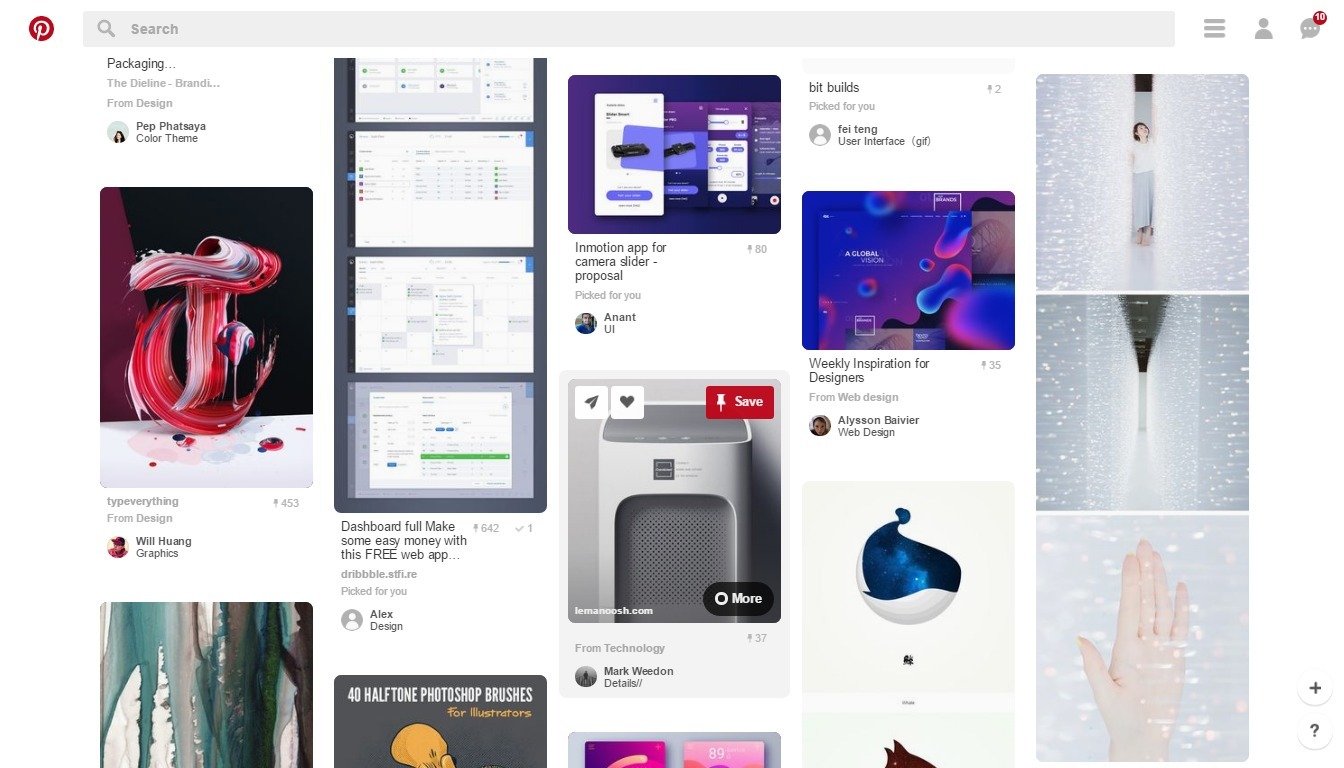
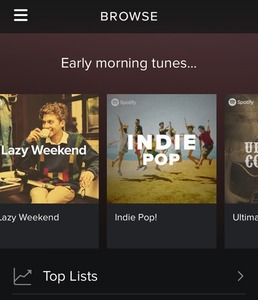
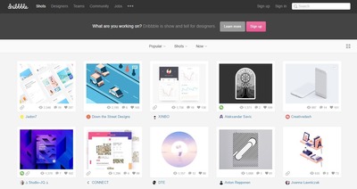
▲ Pinterest uses cards to group heterogenous items together: each card differs in amount of information and occupies a different amount of vertical space.
Usage
- Use to display content composed of different elements
- Use to showcase elements whose size or supported actions vary – like photos with captions of variable length.
- Use when displaying content that…
- As a collection, consists of multiple data types (images, movies, text)
- Doesn’t require direct comparison
- Supports content of highly variable length (captions, comments)
- Contains interactive content
- Use to visually group digestible portions of information that call for an action; like accepting a request, or accessing more details.
- Use to gather various pieces of information about a single subject to form one coherent piece of content.
- Cards are better suited when users browse for information than when they search.
- Cards work best for collections of heterogeneous items (when not all the content is of the same basic type).
This card is part of the UI Patterns printed card deck
A collection of 60 User Interface design patterns, presented in a manner easily referenced and used as a brainstorming tool.
Get your deck!More examples

Solution
Display entry points to detailed and varied content in similar shapes. A card could contain a photo, text, and a link about a single subject.
Consider only scrolling collections of cards in one direction: horizontally or vertically. Card content that exceeds the maximum card height (if scrolling vertically) or width (if scrolling horizontally) is truncated and does not scroll, but can be expanded. Once expanded, a card may exceed the maximum height/width of the view.
A card typically includes a few different types of media, such as an image, a title, a short summary and a call-to-action button.
Cards can be manipulated
One of the most important things about cards, is their ability to be manipulated almost infinitely. They can be turned over to reveal more, stacked to save space, folded for a summary – and expanded for more details, sorted, and grouped.
We can hint what is on the back side or that the card can be folded out. The resemblance of Cards to the physical world makes them a great conceptual metaphor for which we can easily relate all sorts of manipulations.
Rationale
Browsing is a large part of interaction, and users want to be able to quickly scan large portions of content and dive deep into their interests. Users can experience difficulty browsing text-heavy sites as displaying extra details for each item can clutter the screen and prevent efficient scanning.
Cards are great for showcasing aggregated elements whose size or supported actions vary. Each card serves as an entry point to more detailed information, so it shouldn’t be overloaded with extraneous information or actions. They are dismissible, swipeable, sortable, and filterable.
Cards allow you to present a heavy dose of content in a small and digestible manner: they divide all available content into meaningful sections, present a summary and link to additional details. A single card is a container that displays various parts of related information, from which users can get even more information.
Why use cards?
Cards help chunk data into content that is more easily aids scanned. Furthermore, cards are:
- Intuitive. Cards look similar to real-world tangible cards as they appear in user interfaces. They seem familiar to users. Before cards became popular elements in mobile and web apps, they were all around in real life: business cards, baseball cards, sticky notes. Cards represent a helpful visual metaphor that allow our brains to intuitively connect a card with the piece of content it represents – just like in real life.
- Easy to digest. Cards don’t take up much space and forces the designer to prioritise its content and form. In turn, each card becomes digestible pieces of content that are easily accessed and scanned. Cards make it easier for users to find the content that they are interested in – in turn this empowers them to engage in any way they want.
- Cards are attractive. Card-based design often relies heavily on visuals (especially, images); any copy is usually secondary to the visual in terms of the information architecture. The emphasis on using images can help make card-based design more attractive to users than the same content not arranged in cards.
- Advantageous for responsive design. Cards are almost infinitely manipulatable: the rectangular shape resizes smoothly to fit the horizontal and vertical orientations of different screens (easily scale up or down), which means users get a consistent experience across all devices.
- Shareable. Cards can encourage users to share content on social media, as it allows users to easily share only specific chunk of content vs a whole page.
Discussion
As with any design technique, a card-style interface is not a silver bullet for perfect usability.
When to use cards
However, there are some cases where cards are especially applicable:
- Browsing over search. Cards are better suited when users browse for information than when they search.
- Similar items. Cards work best for collections of heterogeneous items (when not all the content is of the same basic type).
This is usually the case when you have:
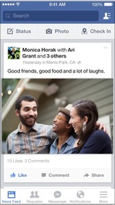
- A stream of events. For example, Facebook uses cards to present a quick overview of recent events in their news feed. Facebook’s news feed is an endless stream, whereas cards are individual. The point of cards here is disaggregation: users are able to take a single event from the stream and share it.
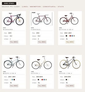
- A discovery-based interface. Cards allow relevant content to naturally reveal itself, making possible for users to dive deep into their interests. Take a look at Dribbble, an online creative community which showcases creative work. Card-based design is a very suitable way for presenting such type of content.
- A workflow tool and when you can present a single task in a flow as a card. Cards can be easily categorized for a list of tasks. The Trello task management app does a great job of using a card-style interface to create a dashboard for users, where each card represents a separate task.
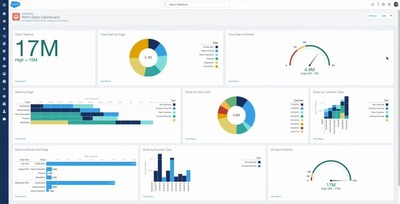
- A dashboard application*. Dashboards usually display a variety of content types simultaneously on the same page. In such situations, the card metaphor can help create more obvious differences between items where each card can accommodate different role.
When you shouldn’t use cards
There are also cases, where it’s better to opt for an alternative solution to cards:
- When the content you want to present is already grouped into very homogenous items such as:
- A list of similar products. The use of cards will be interfer with searching for specific items or compare different items. A standard list view is more relevant for such a case as a list view provide better scannability and requires less space.
- Gallery of images. The use of cards can distract the user and prevent easy scannability. A standard grid view can be more relevant when it allows the human eye can to scan the grid and its items more easily.
- Strict order. When you have a strict order in which you want users to scan the content. Card layouts typically deemphasize ranking of content as they don’t provide obvious information about the order in which content should be viewed on a page. As a result, there’s little hierarchy in the visual information presented. Cards can make all content look similar, which can make it hard (or even impossible) for users to easily discern the ranking importance of content.
The problem of visual overload
The most common pitfall of card-based design is the danger of visual overload. As cards are often used for
sites which contain loads of information, they can end up producing a cluttered feel (especially on a large viewports), making it harder to parse the layout visually.
How to improve design and interaction with cards
There are a few things that can improve card design.
- Follow a rule “one card, one concept”. A card can contain several different elements, but they all should be about a single subject. This allow users to select the part of content they want to consume, share, or interact with.
- Use whitespace generously. Cards are often represented by highly coherent individual content that are small blocks of “mini design” of their own. This is why it is essential to give each individual card room to be seen, read and understood. Add plenty of whitespace around each block to provide users time and peace to visually reset as they look from one card to the next.
- Limit the content length. A card should contain only essential information and offer a linked entry point to further details, rather than the full details themselves. As designers try to put too much content into a card, the card can end up becoming too wide or too long and in turn lose its original connection to the card metaphor as it doesn’t look like a card anymore.
- Make card visually pleasing and simple at the same time. The image is the king of the card design: you need a great image to draw users to each individual card. Opt for simple and basic typefaces (such as sans-serif with normal weight for card body copy), as basic typography maximises readability and helps browsing.
- Create content hierarchy. Hierarchy within cards help direct the attention of users to the most important information. Place primary content at the top of the card and use typography to emphasize primary content. Use dividers to separate content areas that need more distinct visual separation.
- Make the entire card clickable, not just certain portions. This larger touch zone substantially improves usability on both touchscreen devices and mouse-based devices (Fitts’s Law states that this makes user interaction more likely).
- Take advantage of animation and movement. Use visual feedback and hints to assist users to better understand how to interact with user interface. For example, you can use an animated effect on cards when the cursor hovers over them, which signifies to the user that the card can be clicked.
Cards design and visual signifiers
Modern digital cards aren’t pure skeuomorphic concept, but quite often, using consistent metaphors and principles borrowed from physics help users make sense of interfaces and interpret visual hierarchies in content. In the case of cards there are couple of things you can do:
- Use rounded corners to visually resemble a real-world tangible card in shape.
- Add a slight drop shadow to show depth and indicate that the entire card is clickable.
1 Why Cards are the future of the web by Paul Adams
2 Cards – Components from the Google Material Design design spec
3 Play Your Cards Right: Exploring the Cards Trend in Web Design at awwwards.com
5 Designing card-based user interfaces by Nick Babich
6 Best practices for cards by Nick Babich
7 Cards: UI-Component Definition by Page Laubheimer
8 The Complete Guide to an Effective Card-Style Interface Design by Carrie Cousins
9 Twitter, canvases and cards by Benedict Evans
More examples of the Cards pattern See all 11 example screenshots
User Interface Design Patterns
- Forms
- Explaining the process
- Community driven
- Tabs
- Jumping in hierarchy
- Menus
- Content
- Gestures
- Tables
- Formatting data
- Images
- Search
- Reputation
- Social interactions
- Shopping
- Increasing frequency
- Guidance
- Registration
Persuasive Design Patterns
- Loss Aversion
- Other cognitive biases
- Scarcity
- Gameplay design
- Fundamentals of rewards
- Gameplay rewards