Fill in the Blanks
Design Pattern
Alternate titles: Natural language form.
Problem summary
The user needs to enter data into the system
Example
Usage
- Use when you find yourself creating labels for input fields that do not really explain what the input field is all about.
- Use when you find yourself creating long and complicated labels for input fields, which in turn makes it hard for users to understand.
- Use when you can possibly express the context of the input field by placing it in a sentence.
- Use when filling out the input field is mandatory or strongly appreciated. Leaving parts of a sentence unfilled creates annoyance in the user.
- Use when you have a relatively small set of input fields to place as part of the sentence. If you have many input fields, placing them all in a sentence can seem tiresome for the user, as the sentence structure forces the user to read all sentences and place all input fields in the context of those sentences.
- Do not use if you have many fields that are not required to be filled out.
This card is part of the UI Patterns printed card deck
A collection of 60 User Interface design patterns, presented in a manner easily referenced and used as a brainstorming tool.
Get your deck!More examples


Solution
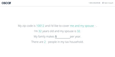
Order input fields in the form of a sentence with input fields as blank spaces to be filled by the user. Write a sentence and let the user fill in the blanks of the sentence by selecting or filling out input fields that are in place of words.
When the input field is not inserted at the end or the beginning of the sentence, it is important for the general readability and understandability of the interface, that the input fields does not take up more space than the height of one text-line. Input text boxes, and drop-down lists therefore work the best for this sort of usage.
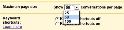
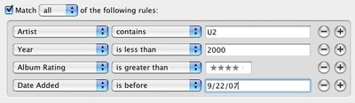
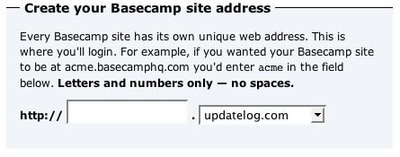
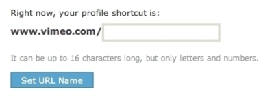
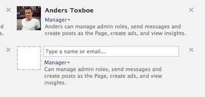
The pattern is often seen in applications that filter large lists out by conditions. In Apple’s iTunes, the pattern is used to create conditions for smart playlists (See examples at bottom of page).
The biggest drawback of the pattern is its poor ability to be localized into different languages as the placement of each input will possibly have to be rearranged to match the grammar of each language. Using “Fill in the blanks” in this way hinders immediate conversion of a user interface to other languages.
Rationale
We all know how to finish a sentence. By inserting input fields into a sentence of words, the user interface is made self-explanatory, possible misundestandings are minimized, and the context is understood more clearly.
Sometimes, it can be hard to find a describing label for an input that does not alienate the user to the system.
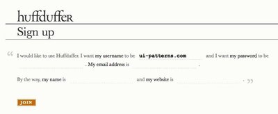
Consider the example in the bottom of the page from the Ruby On Rails wiki. Here, both the submit button (“Save”), the input field for the author name, as well as a back in history link are presented all in the same sentence. These three options could have easily been represented on separate lines with a separate label for each option. Instead, the three options are presented as a sentence, and thus put in context of each other.
Furthermore, the example above uses the Input Prompt pattern to encourage users to fill out the text field.
The “Fill in the blanks” makes the interface somewhat self-explanatory. Our semantic capabilities as human beings allow us to fill in the missing parts of a sentence.
More examples of the Fill in the Blanks pattern See all 16 example screenshots
User Interface Design Patterns
- Forms
- Explaining the process
- Community driven
- Tabs
- Jumping in hierarchy
- Menus
- Content
- Gestures
- Tables
- Formatting data
- Images
- Search
- Reputation
- Social interactions
- Shopping
- Increasing frequency
- Guidance
- Registration
Persuasive Design Patterns
- Loss Aversion
- Other cognitive biases
- Scarcity
- Gameplay design
- Fundamentals of rewards
- Gameplay rewards
1 comment
Marco on Apr 08, 2011
One problem with this design pattern is the difficulty of translating it into languages where the word order may be different.
Comments have been closed