Lazy Registration
Design Pattern
Alternate titles: Immediate Immersion, Gradual Engagement.
Problem summary
The user wants to immediately use you and try your website without conducting a formal registration beforehand
Example
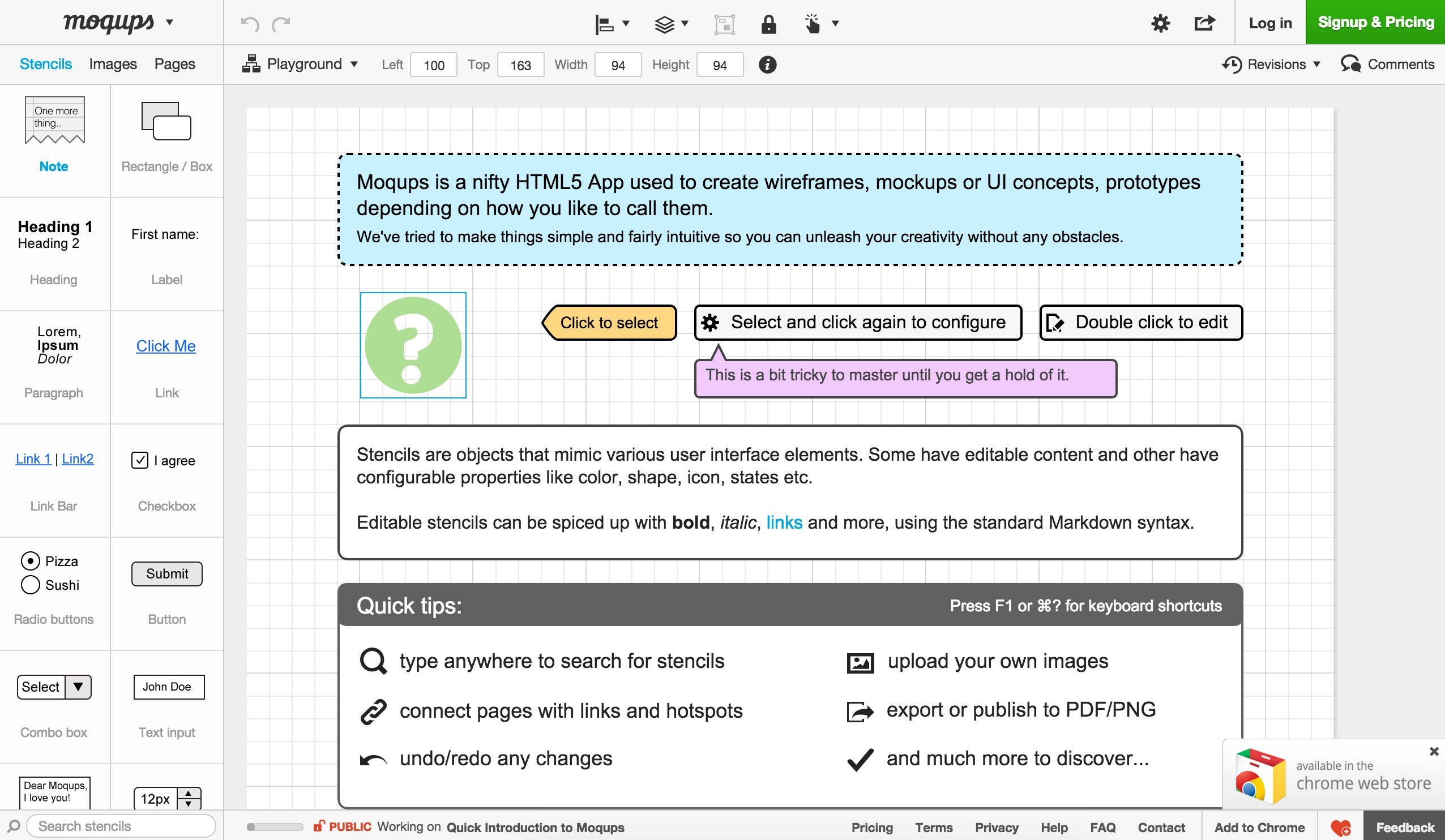
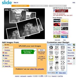
▲ When you go to Moqups, you are instantly taken to the application in full effect. It's opened up on a working document that explains how everything work.
Usage
- Use when it is critical for your website to let the user browse around and interact with your website before actually registering an account
- Use when giving away the personal information required for a formal account registration is a big step for your users
- Use when you want to allow your users to try out your website (and in turn compare it to alternatives) before making the decision to register an account with your website
- Use when registering an account requires an exchange of money, why the user might want to “browse around” your product first in order to make a decision.
- Use when you don’t want to force your users to register at first – when you don’t want to put too much pressure on your users
- Use to make your users start entering data into your system right away. When they have already invested time in your system, the step to registering an account is smaller than if no time has been invested.
This card is part of the UI Patterns printed card deck
A collection of 60 User Interface design patterns, presented in a manner easily referenced and used as a brainstorming tool.
Get your deck!More examples


Solution
Allow users to access a limited set of features, functionality, or content before or without registrering.
Let users interact enough with your system so that an actual registration is just another small step in a larger process: a small step, not an obligation.
The light version of this pattern is the shopping cart of an e-commerce site, where the user can accumulate relevant products in a cart and then in turn register an account if he or she chooses to make a purchase.
In the heavier version of this pattern, an anonymous user account is immediately created for the user – full with an auto-generated database ID and a complimenting cookie with the account’s ID that will ensure that the user’s details and the information he or she has entered will be remembered upon the next visit. With appropriate intervals, inactive anonymous accounts are cleared from the database in order to not clutter it up.
As the user interacts with the system, data is accumulated to the account. While some data might not be shown to the user other kinds of data will. It is the latter kind of data that in turn will make the user register – the visible evidence that the user has invested energy into using the system. A smart way to gather such data is to expose holes of data that the user can populate.
Two such holes are the username and password: the two bits of information that will allow the user to log into his account from more than one computer.
Rationale
Deliver value before prompting for conversion. Shopping carts are a classic pattern that plays on Lazy Registration: users can browse and choose products, but only have to register when they proceed to check out.x
The Lazy Registration pattern allow users to use your system and take action before or without registrering. The idea is to let users interact enough with your system so that the actual registration is just another small step in the larger process. It’s a small step – not an obligation. The classic Shopping Cart pattern is a good example of Lazy Registration: users can browse and choose products and only have to register when they proceed to check out.
For this pattern to work, you need to provide the users with an incentive to give you the registration data you are looking for. You need to provide a worthwhile service to your users for them to give you their data back in return. You want to use classic Carrot and stick motivation – and just as important: communicate the benefit you are providing. If the registration data you are looking for with the user is sensitive, you must be able to assure your users that their data will be safe and secure.
Discussion
Questions to ask when planning your Lazy Registration
- Consider how you can avoid sign up forms in favor of a more gradual engagement.
- If you choose to use the Lazy Registration pattern, make sure that you focus on showing off how you deliver value: how potential customers can use your service and why they should care.
- Auto-generated accounts are great, but if you choose to use them, then make sure to design a clear way for users to access their accounts. Chances are that people will either ignore or not see your account creation mails – and might be uncertain if they even have an account or not. 1
1 Sign up forms must die by Luke Wroblewski
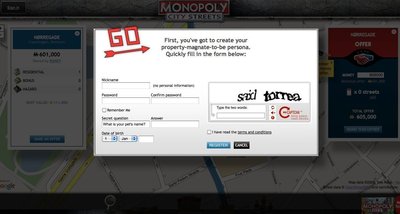
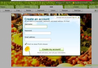
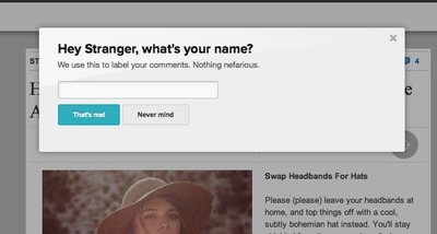
More examples of the Lazy Registration pattern See all 14 example screenshots
User Interface Design Patterns
- Forms
- Explaining the process
- Community driven
- Tabs
- Jumping in hierarchy
- Menus
- Content
- Gestures
- Tables
- Formatting data
- Images
- Search
- Reputation
- Social interactions
- Shopping
- Increasing frequency
- Guidance
- Registration
Persuasive Design Patterns
- Loss Aversion
- Other cognitive biases
- Scarcity
- Gameplay design
- Fundamentals of rewards
- Gameplay rewards
16 comments
Jasper Kennis on Mar 20, 2008
Voted negative, for the simple reason that I believe (so no prove what so ever here) users are more likely to just toy around without really getting involved if you don’t demand them to really decide to take part in what ever you have for them. I think having to registrate to be able to do something can be annoying, but at te same time makes you feel more involved, what makes you remember, what makes you come back. I guess…
bryan migliorisi on Mar 22, 2008
I completely agree with Jasper. I wouldnt implement a ‘try-before-you-buy’ type of account in any of my web sites. Most of my sites do not require an extensive registration process anyway, so it would be only a minute or so of the users time and that 1 minute may turn away a few potential members, but at the same time it presents those who go through with the process a bit more involvement and that makes them likely to return.
thomas on Mar 24, 2008
Absolutely positive on this one, I acutally saw very impressive numbers of the effect such a lazy registration can have.
Janko on Mar 25, 2008
I also voted negative. Account registration pattern describes an extremely easy way to register a user and requires only a few fields to fill, so, I would always force users to register instead of letting them to try.
Andrew Assarattanakul on Mar 25, 2008
There is a good and a bad from this type of registration.
Some people will feel cheated if they spent their time on something then prompted with a registration form to save their work. You may get a few more people to register because they have something to loose if they don’t.
On the other hand you will get more people to try out your web site because they can use it without having to create yet another account on another web site.
JoseFajardo on Mar 31, 2008
You guys are voting it down for business reasons. The actual pattern is sound in my opinion. You guys have to remove your bias for judging based on business reasons. This pattern meets the needs of what a “Lazy Registration” should be like!
Voted up!
Lindsey on May 28, 2008
A positive vote from me! Some services are perfect for this, like the calendar in the example, or any of the to do apps. Allowing the user to begin playing with a new application is an excellent way to pull him/her into the service. Also, what better way to explain the positive points of a service than by letting the user see the features?
JustAGuy on Jun 03, 2008
I totally agree with JoseFajardo and Lindsey.
Even for business reasons I would you use it. It’s the virtual variant of try-before-you-buy. If the product / service is perfect for your users they will coe back. Not because the filled out some form.
wiNZurf on Mar 05, 2009
I like this pattern, the engagement value is there, the user will be more likely to register after they have created something of value than they would if they had to register before hand. Once they have made an ‘investmnet’ they are more likely to protect it.
Patric Schmid on Jun 26, 2009
To some degree i understand the arguments against a Lazy Registration because you generate more “quality” users… One invested efford in registration = more interested and committed to service.
The PROBLEM with this thought is: your assuming a visitor fully understands the goal and benefits of your service instantly… – but does he really?
A user decides within 8 seconds if he is on the right page or not. (speaking he has found a site which solves his problem)
I would assume there are very few web-services which could claim a 8 “second-understanding”
Therefore i would always chose a free-trial or lazy-registration approach! Even give the users the main benefit without registration, then afterwards trading additional services for a registration.
I think the barrier to registration is very low if a user already had a benefit from my service or is committed through data he put in.
Greetings
Patric (Benutzerzentrale.de)
dvir on Jul 21, 2009
Totaly voted positive.
The difference between half a minute of registration and 5 minute registration is not as big as the difference between half a minute registraion and zero minutes registration.
rtdt on Aug 21, 2009
I agree this is a solid pattern and should be used if the information the user is being asked to interact with is not too involved. It depends on what this registration applies to. Tax forms? Obviously a full registration makes sense. A calendar application that simply lets me view friends’ birthdays? A light-weight solution makes sense.
A good rule of thumb is the registration should never take longer to fill out and authenticate than the actual function the user is trying to complete.
Bruce P. Henry on Oct 21, 2009
To me it seems clear that the user views the form fill on signup as a cost rather than a benefit. However, once they have used the application/site to produce something of value they go into “loss avoidance” mode. There is plenty of research out there showing that loss avoidance is a more powerful motivator than gain seeking. For sites that can use it, lazy registration would seem to be a very good business decision.
That said, even were it not, this is still a useful pattern for certain sites.
Andy W on Sep 07, 2010
Like all design patterns, this works really well in the right context. How you implement will depend on the specifics of the problem that you are trying to solve, but this is a mature and proven solution.
Japser, getting users to “toy around” is the whole point. That’s what creates the interest and engagement required for commitment in the first place.
LRC on Mar 16, 2011
This is no worse the ubiquitous 30 day software trial. In fact a time restricted ‘Lazy Registration’ would probably be a logical extension to the pattern outlined in the definition. I can’t help but suspect that people just feel put out by the name…
ymvtech on Nov 06, 2015
Reading the comments here posted between 2008 – 2011, I wonder if the same people that voted negative would still vote negative in this new age of 2015 when we have more volatile, rapid and less attentive users of systems and applications. Almost every designer of this day now opts for the Lazy Registration pattern without a choice.
Comments have been closed