Breadcrumbs
Design Pattern
Problem summary
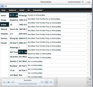
The user needs to know their location in the website's hierarchical structure in order to possibly browse back to a higher level in the hierarchy.
Example
Usage
- Use when the structure of the website follows a strict hierarchical structure of similar formatted content.
- Use when the structure of the site is partitioned in to sections which can be divided into more subsections and so on.
- Use when the user is most likely to have landed on the page from an external source (another site deep linking to the web page in question). For instance from a blog or a search engine.
- Use when the page in question is placed fairly deep into the hierarchy of pages and when no other form of visual navigation can show the details of the same deep level.
- Use together with some sort of main navigation.
- Do not use on the topmost level of the hierarchy (typically the welcome page)
- Do not use alone as the main navigation of the website.
This card is part of the UI Patterns printed card deck
A collection of 60 User Interface design patterns, presented in a manner easily referenced and used as a brainstorming tool.
Get your deck!Solution
Reveal the user’s hierarchical location and provide links to higher levels.
- Show the labels of the sections in the hierarchical path that lead to the current page being viewed.
- Each label is a link to a section.
- The label of the current page is at the end of the breadcrumb and is not linked.
- Each label is separated with a special character. Popular characters are » (
») or >. - The separating characters and the spaces between the links and the labels are not linked.
- The labels of each section preferably match the titles of that section.
Rationale
Breadcrumbs serve as an effective visual aid, indicating the location of the user within the website’s hierarchy, making them a great source of contextual information for landing pages. Also, breadcrumbs allow for easy navigation to higher-level pages.
- Breadcrumbs inform users of their location in relation to the entire sites hierarchy.
- The structure of the website is more easily understood when it is laid out in a breadcrumb than if it is put into a menu.
- Breadcrumbs take up minimal space and even though not all users use them, they still hint the structure of the website and the current location of the page in question.
- The term ‘breadcrumb’ is deceptive, as it implies the history of how the user got to that page. A more correct term would describe the current location’s place in the hierarchy of the website.
This article has been commented 17 times.
More examples of the Breadcrumbs pattern See all 28 example screenshots

From bell.ca

From profoto.com

From typepad.com

From marchanddetrucs.com

From psd.tutsplus.com

From delicious.com
User Interface Design Patterns
- Forms
- Explaining the process
- Community driven
- Tabs
- Jumping in hierarchy
- Menus
- Content
- Gestures
- Tables
- Formatting data
- Images
- Search
- Reputation
- Social interactions
- Shopping
- Increasing frequency
- Guidance
- Registration
Persuasive Design Patterns
- Loss Aversion
- Other cognitive biases
- Scarcity
- Gameplay design
- Fundamentals of rewards
- Gameplay rewards


17 comments
Rob on Mar 26, 2008
While I realize it is in common use, I think the name Breadcrumbs connotates a different metaphor than way of documenting a user’s location in a hierarchy. The story is that a traveler dropping breadcrumbs in order to retrace the route. So if you navigate from A to B to C to B to D then a true breadcrumb trail would be A→B→C→B→D. The algorithm recommended here would return A→B→C→D.
I’m not arguing that this isn’t more useful; I’m arguing that the name Breadcrumb doesn’t describe this pattern. A browser history implements something more akin to route retracing.
Pattern names should accurately indicate its function. While I don’t have an alternative suggestion, perhaps someone else will. (HistoryTrail perhaps?)
Peace,
Rob:-]
Keil on Dec 17, 2008
I agree with you Rob, although I also don’t have a much better suggestion. Perhaps “Site Ladder” or “Application Ladder,” because it helps the user climb back up the site’s page hierarchy?
I want to emphasize, though, that I think whatever you call this, it is an important and appropriate design technique in certain situations (as described above).
Dmitri on Jun 23, 2009
As much as I see the point in the two above comments, it is a reality that in most agencies that is exactly what it is called – why reinvent the wheel?
markv on Aug 21, 2009
Visually, and conceptually I think the breadcrumb term is quite apt if you think about the story of Hansel and Gretel.
The bread crumb trail stretches from home to your current location.
The further you are from home the longer the trail. This is also visually what happens to the string of words in the web version. The trail is long if you are far from “home”.
You can follow the trail (by eating up each bread crumb) until you get back home. So the crumbs (directories) disappear as you navigate your way towards home.
In both the story and the web version, the breadcrumb trail shows 1 single path back home.
In both cases the path is a very minimal indicator of how to get home.
Both help you navigate a fixed space.
In the Hansel and Gretel story, the bread crumbs are not really like the browser history “showing you where you have been”. Because in the web you can jump from any other web page. However the web breadcrumbs show a path through a fixed navigation space (the web site you are on) which is more akin the fixed physical space (the forest that Hansel and Gretel are walking in ).
markv on Aug 21, 2009
In short:
The breadcrumbs (in Hansel and Gretel and in this web pattern) are a minimal single path that lead you step-by-step (crumb-by-crumb) back home through a fixed but complex navigation space ( the forest / a complex web site).
It would be very difficult to find a better way to describe all these concepts in a single word.
tb on Sep 16, 2010
I think the term “breadcrumbs” has been around so long (at least 10 years) that it has become a defacto standard term that many already know and use.
Although a more accurate phrase might be something like, “Hierarchical Orientation Navigation” of which could be either horizontal or vertically oriented.
Also, unlike true breadcrumbs (ala Hansel and Gretel), which are accessed in a linear fashion, back to the origin, the HON provides random access throughout the entire hierarchy.
kh on Sep 17, 2010
Breadcrumb is an industry term and those who question it are not in the industry. Ever UI designer, web designer, web developer knows what a breadcrumb is. No need to change anything.
martin on Sep 28, 2010
I agree with Rob and I think it is tragic that the name “Breadcrumbs” has stuck :( I think Site Locator could be better, or at least more accurate. Where I work, we see “Breadcrumbs” as a fancy-schmancy PR bureau invention.
CH on Oct 26, 2010
I need a “cooler” shortcut drop down than just the run of the mill drop down. Actually, something that selects from a list, in a small space. Any ideas?
GS on Feb 04, 2011
kh,
two problems:
first – there is no such thing as the ‘industry’.
I’d say that 60% of all the UX people I meet in the industry (I live in london so I do meet a lot) are newbies or come from graphic design or web design.
The very few UX ‘thinkers’ rather than jsut practictioners, have been criticizing not only the name but the utility itself of breadcrumbs.
In short, as everything on the web is linked in a network and not in a hierarchy, breadcrumbs can result more confusing than anything else.
second – even if the web designers and graphic designers have indeed established the use of breadcrumbs and their naming, over a long time, that is no good reason to keep a name and a concept that is misleading. Things change name all the time. In any ‘industry’.
Eric Landwehr on Feb 21, 2011
The concept of a “breadcrumb” is really to provide a person with a secondary means of navigation, or in this case, way-finding, that indicates where on a site the page or user is. Perhaps it should be called “orientation navigation”. In any case, I can understand why in the true sense, or meaning of the word, breadcrumbs, it doesn’t fit the bill in the context of finding one’s way back along the path that he/she followed.
Shaun on Jul 27, 2011
I agree with Eric, in that a “breadcrumb” is a secondary means of navigation. I think changing what is clearly a popular term now, to something more clinical, just so the community can be happy with its context is a bit much.
If we understand its meaning, and the laymans understand its meaning. Just why exactly are we considering a change?
~N~ on Sep 12, 2011
The calling of a thing by its right name has far more importance than mere “happiness with context”.
It decides how we think, the metaphors used to describe other words, the appearance of words based on them, and the extensions of other metaphors.
We humans do not just find an idea and connect it with a word. Much more is going on in our language.
—ScarySquirrel (~N~)
Jesse M on Oct 10, 2011
“Breadcrumbs” is more than adequate. To elaborate on MarkV’s point, above, the “breadcrumbs” of folklore were never conceived on multiple dimensions… it’s a one-dimensional path that you can follow in order to return to your destination.
The functional aspects of the metaphor: a trail of breadcrumbs have an explicit “beginning” (home page/the cottage); it has an endpoint that’s not determined until a sequence of decisions is made by the user; it can be followed in reverse from the destination to the origin, and then followed back the other way if necessary. Makes perfect sense.
kh on Jan 12, 2012
Jesse M completely agree. Why make things so complicated. There is a reason why ‘breadcrumbs’ has been around for so long. It’s easy to remember and it’s sticky. Even children can relate. Why over-complicate things? There is nothing misleading about it.
VW on Sep 29, 2014
In my opinion, both Rob and people who find no fault with the term “breadcrumbs” have a valid point. From the pragmatic point of view, he term is “juicy” enough to be memorable, and has been so, enough to survive for 10 years. It just works, and that is a clear measure of success.
On the other hand, the difference between A>B>C>D and A>B>C>B>D algorithms is also clear. The first one is hierarchical, and the second one is historical, and the term “breadcrumbs”, if technically understood, would only refer to the historical one, and thus not be technically correct.
While it is important to know what works in practice, it is also very important to be aware of the semantic differences in meaning and cognitive aspects of a term—especially because UX is a quintessentially cognitive domain.
Comments have been closed