Walkthrough
Design Pattern
Alternate titles: Intro Tour, Joyride, Guided Tour.
Problem summary
The user wants to learn the products and services you offer in order to make a decision to join a service or buy a product.
Example
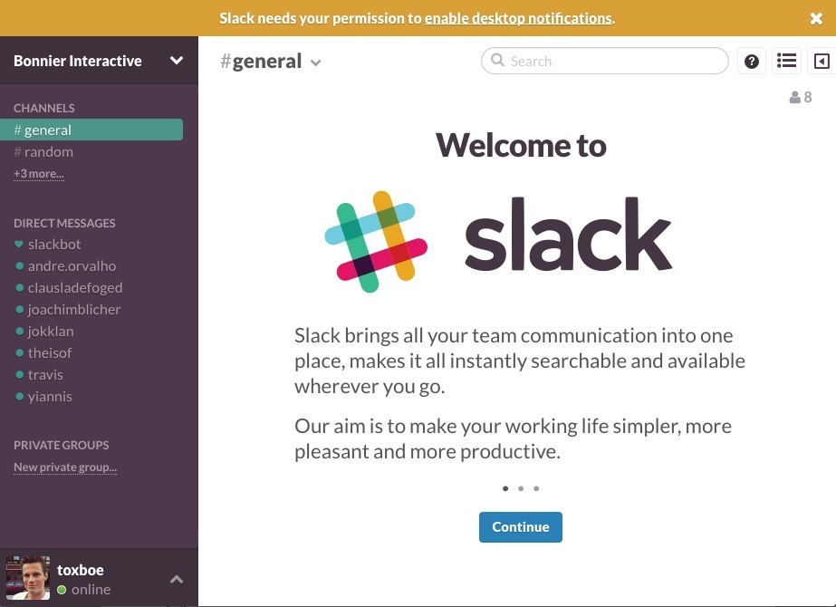
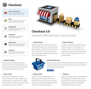
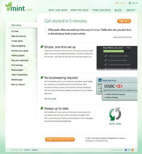
▲ When you first enter the online chat software, Slack, you're greeted with a short tour of the product.
Usage
- Use to give users an insight into what a product is about before they spend time or money on the full product.
- Use to help sell your product.
- Use to allow users to make an “informed” purchase decision.
- Use to instruct users in how to solve common tasks.
- Use to teach users about your product and what it can do.
- Use to teach users about uncommon features.
- Use to teach users about non-website related issues.
This card is part of the UI Patterns printed card deck
A collection of 60 User Interface design patterns, presented in a manner easily referenced and used as a brainstorming tool.
Get your deck!More examples
Solution
Present the main features of your product before the user starts using it. Present your product and/or value proposition before the real user experience begins. Walkthroughs are often presented as either a static or animated slideshow or with video. Keep it short and to the point as users often skip or breeze through in order to get started.
A Walkthrough explains a product or service in terms of features, benefits, and in general what the product or service allows you to do. It is most often split into more than one section, which is sometimes put on separate pages.
With this in mind, here are a few principles to keep in mind when developing a Walkthrough.
Focus on users’ tasks
Whether the Walkthrough is strictly a marketing tool or a tool to teach, a focus on the users’ tasks is important. How can you help them? Aim for a good balance between only describing essentials and explaining everything. Only describing essentials might not give users an elaborate enough view of your product to aid their decision to engage with your product. If you are too elaborate you might on the other hand scare then away.
Resist the urge to show off the latest and greatest features – the most important thing is to convince your users that your product will help them with their fundamental problems. New users aren’t interested in your bells and whistles; they just want to accomplish their goals1.
Provide visual references
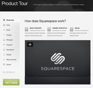
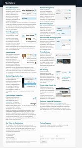
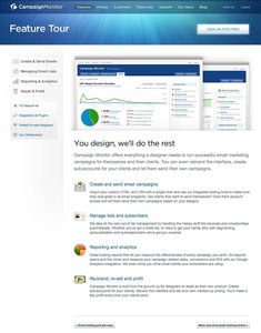
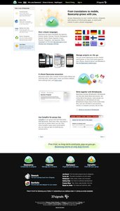
Don’t just write about your product and its features. Show it! Include screenshots, illustrations, and even video clips of how to use your product.
This will allow your users to get a better feeling of where exactly to click – but also how easy your product actually is – how it was meant to work and be used.
Include direct links
As users use Walkthroughs to learn about your product or service, they will go back and forth between the Walkthrough and the product. It is their reference point, so make it easy for them to go back and forth between the two. Provide direct links, if possible, to the sections you explain.
Address issues or concerns up front
Address the top concerns your users might have when they are trying to decide whether or not to use your product or not. “Is it safe”, “Can I import my data easily?”, “Can I export my data if I decide to move?”. Put any concerns to rest so that your users can start using your product or service with confidence.
Rationale
A Walkthrough of your product or service helps inform users about:
- What your product can do
- If your product is what they’ve been looking for
- If your product will help users accomplish their tasks
- Whether or not they should join your service or pay for your product
Purchasing a product or service can be costly and users will need a significant amount of persuasion and encouragement before buying in. A Walkthrough allows users to get a glimpse of your product without having to sign up.
1 Guided tour design pattern at welie.com by Martin van Welie
2 Submit now – Designing persuasive web sites, New Riders, 2003
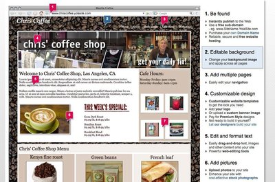
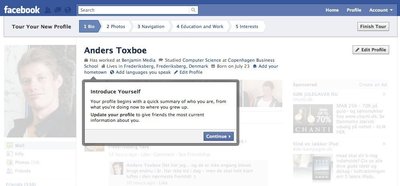
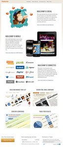
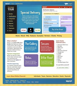
More examples of the Walkthrough pattern See all 34 example screenshots
User Interface Design Patterns
- Forms
- Explaining the process
- Community driven
- Tabs
- Jumping in hierarchy
- Menus
- Content
- Gestures
- Tables
- Formatting data
- Images
- Search
- Reputation
- Social interactions
- Shopping
- Increasing frequency
- Guidance
- Registration
Persuasive Design Patterns
- Loss Aversion
- Other cognitive biases
- Scarcity
- Gameplay design
- Fundamentals of rewards
- Gameplay rewards
1 comment
Scott on Jan 12, 2011
Nice article, it’s definitely a good idea to include visual references in the tour. Why tell your users (or customers) when you can just as easily show them?
Comments have been closed