Module Tabs
Design Pattern
Problem summary
Content needs to be separated into sections and accessed via a single content area using a flat navigation structure that does not refresh the page when selected.
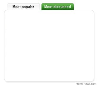
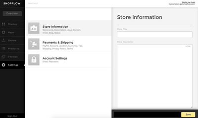
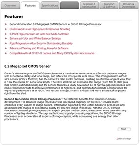
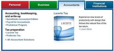
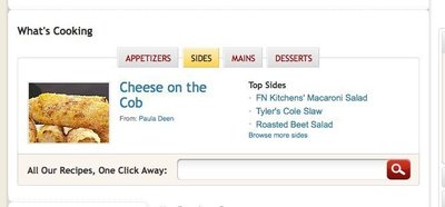
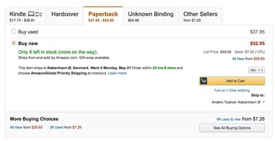
Example
Usage
- Use when there is limited visual space and content needs to be separated into sections
- Use when there are between 2 – 9 sections of content that need a flat navigation mode.
- Use when you need to keep user attention by circumventing page refreshing.
- Use when section names are relatively short
- Use when the content of each tab can be viewed separate from each other, and not in context of each other.
- Use when the content for each tab has similar structure
- Use when you need to show what tab is currently being viewed
- Do not use when the content inside each pane would function just as well in its own separate page.
More examples


Solution
- Present the content of one tab inside a box (content area)
- Place a horizontal bar on top of the content area with links representing tabs
- Refrain from having more than one line of links in the top horizontal tab bar
- Use color coding or other visual support to indicate what tab is currently being viewed
- Present the content of each tab in the same content area
- Only one content area should be visible at a time
- Maintain the same structure of the top horizontal tab bar after a new tab has been clicked
- Only the content area of the tabs and the horizontal tab bar should be changed when a user clicks a new tab
- If possible, the page is not refreshed when a tab is clicked.
- A new page is not loaded when a tab is clicked
Rationale
The Navigation tabs pattern is an extension of the desktop metaphor in which physical objects are represented as GUI elements. Navigation tabs are derived from the idea of folders in a file-cabinet and are thus familiar to the end user
Module Tabs provide an easy way to show large amounts of similar structured data parted by categories
Tabs create a context for content, when a tab is selected the relevant content is loaded inside the content area.
This article has been commented 3 times.
More examples of the Module Tabs pattern See all 9 example screenshots
User Interface Design Patterns
- Forms
- Explaining the process
- Community driven
- Tabs
- Jumping in hierarchy
- Menus
- Content
- Gestures
- Tables
- Formatting data
- Images
- Search
- Reputation
- Social interactions
- Shopping
- Increasing frequency
- Guidance
- Registration
Persuasive Design Patterns
- Loss Aversion
- Other cognitive biases
- Scarcity
- Gameplay design
- Fundamentals of rewards
- Gameplay rewards
3 comments
Rainer on Apr 15, 2009
What if I have to or want to show more sections in my module than the module’s width? Does anyone know a good pattern for this?
I only know some solution for this but am not sure which is really good:
- showing several rows of tabs… which looks really ugly
- showing arrows to move the tabs (like for the spreadsheets in Excel or for the browser tabs in Firefox)
- showing only as many tabs as fit in the row and offer further tabs in something like a dropdown menu
Any other ideas, recommendations or tips for good examples?
Tisha on Mar 16, 2010
Virgin.com has something similar, you could actually take a que from Firefox tabs and Virgin.com where in you display the tabs you have room for then add a [More +] tab, the issue then is that it’s not really a tab, but more or less a shortcut that updates the “More” tab. I’ve done something like this before using stacked tabs inside a tab. The stacked tabs were all related views of the tab they were contained within.
Garrett on Mar 04, 2011
I wanted to point out a very good point from a comment on the navigation tabs page.
“The background color of the selected tab should match (or at least seamlessly transition into) the background color of the contents of the tab. This visually ties the content to its tab.”
Comments have been closed