Pull to refresh
Design Pattern
Alternate titles: Swipe to refresh.
Problem summary
The user wants to to retrieve more data or refresh already available contents on the screen.
Example
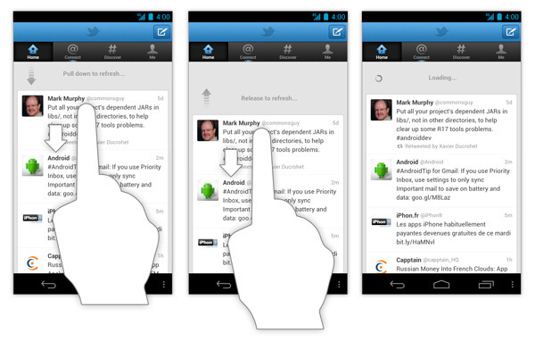
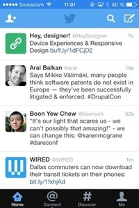
▲ Once user has scrolled to the top of the stream of tweets, they can scroll a little further to refresh the stream.
Usage
- Use to refresh or update any updatable content such as lists, grid lists, and card collections that are sorted in reverse chronological order (a collection is strictly sorted by descending date). Examples:
- Content feeds (Twitter, RSS)
- Inboxes (emails, text messages)
- Use pull to refresh to refresh the entire page or widget. Example:
- Tab in browser (Google Chrome)
- Use when designing for touch screens.
Solution
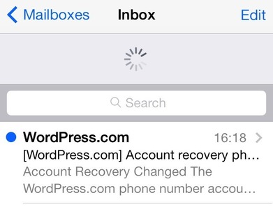
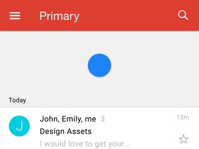
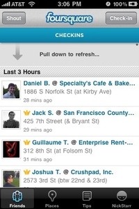
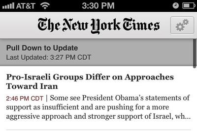
As the user pulls down on the screen with a finger, visual feedback (refresh indicator) appears at the top of the list showing a progress of content update. If the user releases before reaching the refresh threshold, the refresh aborts and visual feedback disappears.
Immediate visual feedback after the action
A user’s wait time begins the moment he initiates an action (swipe the screen for content update). Immediately after that, the application should provide a visual feedback in order to communicate that it has received the request. The user’s confidence in the fact that the refresh is happening, is directly correlated to the visual feedback. You will want to let your refresh indicator continue spinning until data is loading in order to engage the user and prevent confusion.
Refresh indicator should only be triggered by user action
Refreshing content should only be triggered manually by user why the refresh indicator should appear only in conjunction with a refresh gesture. If you do want to notify users about automatically updating content (syncing), you should refrain from using the same indicator.
Meaningful state transitions
Refresh indicators act as intermediaries between different states of the view, helping users to understand what is going on as the screen changes. Refresh indicators should remain visible until the refresh activity completes and any new content is visible, or the user navigates away from the screen.
Rationale
Why should we use pull to refresh?
Pull to refresh are sometimes considered as an extra unnecessary step to refresh, as the user has to manually trigger refreshing or the loading content process of the application. As the pull-to-refresh gesture signifies a manual request for updates, it requires a user involvement into the process and creates a superficial layer between users and their content.
In most cases such kind of operations can be performed automatically using auto-sync procedure, without user involvement. For example, when users use Gmail in the browser on their desktops the service show them the latest emails automatically (and keeps the inbox up-to-date in the background). So why would email clients on mobile devices act differently?
Manual refreshing do provide benefits for the user interface, and can act as a great supplement to syncing:
- It is convenient for users because they’re able to update the screen whenever they choose.
- It feels natural for power users. The pull-to-refresh pattern has become a standard in mobile applications. The pull-to-refresh gesture is so universal now, that it’s hard for developers to ignore using it as power users expect it to be part of the application experience.
- It brings context and continuity. When users open Twitter, the application won’t throwing users to an unfamiliar spot in their Twitter timeline. Instead, the app brings them to the last read tweet. If users want to load new tweets they do it manually by pull-to-refresh.
- It also saves bandwidth for data-conscious customers.
Discussion
Using the Pull-to-refresh pattern helps the user perform a content update task, but this pattern isn’t universally applicable and has its own downsides.
Visible “refresh” button vs Hidden pull-to-refresh gesture
Many developers consider using ‘pull-to-refresh’ as a way to save space on screen (remove UI clutter). While it obviously saves screen estate (nothing is visible on screen at all), users have to know it’s there. Gestures are hidden controls. Thus, it’s not as intuitive as a visible “Refresh” button. A visible refresh button is easier to implement for developer and to use for user (since it’s always visible and available).
When you should use visible “Refresh” button or auto-update instead of Pull-to-refresh
You might want to consider a refresh button…
- When you have a view with pannable content (e.g. map). Because such view has no primary direction or content origin from which users can presume the swipe to refresh gesture will originate.
- When list items are sorted in chronological order. For a “oldest first” lists, you should use a refresh button, because pulling down to append items at the bottom of a list would be awkward.
- When you have a non-ordered list of items. Because when the user is looking at non-ordered list view in the first place, there is no expectation that pulling down will do anything special, and the pull-to-refresh is not intuitive. Photo-related apps that display galleries and calendar apps are a good example of this.
- When the application does not contain content that typically needs to be refreshed on a frequent basis. For example, Evernote app where content is likely not being refreshed without user knowing about it.
Consider no refresh button (or auto-refresh in addition to a button) whenever the things are changing too fast (refreshed becomes stale within a minute or less). Examples:
- Live stock data
- Auction reporting
Thumb-reach issue on iPad
Pull-to-refresh feels natural on a mobile device, but it looks kind of odd on the iPad (especially in landscape mode). It’s almost impossible to update the content using one-thumb interaction — you need either stretch your thumb or put the device on a flat surface in order to comfortably operate with user interface.
Augmented Pull-to-refresh
In the Google Chrome app, the functionality of the pull to refresh interaction has been expanded with the ability to perform two other actions — open a new tab or close the current tab. Like the standard pull-to-refresh design pattern, pulling down on the screen and then letting it go will just refresh the screen:
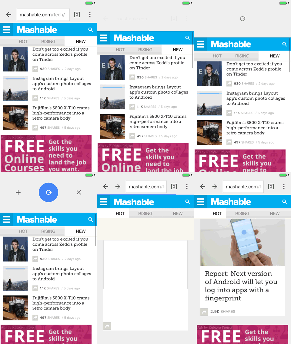
However, when user pulls down and swipe right, Chrome will close the current tab. Alternatively, swiping left will open a new tab. This augmented pull-to-refresh interaction gives users three possible actions to choose from, instead of just one. Opening a new tab with the augmented pull-to-refresh interaction is much more efficient since it can be done with just one smooth gesture.
1 Why the pull to refresh gesture must die by Austin Carr
2 Pull to refresh via Wikipedia
3 Swipe to refresh via Material design
4 Loren Brichter Talks About Pull-To-Refresh Patent and Design Process by Graham Spencer
5 Augmented Pull to refresh by Jacob Gube
More examples of the Pull to refresh pattern See all 11 example screenshots
User Interface Design Patterns
- Forms
- Explaining the process
- Community driven
- Tabs
- Jumping in hierarchy
- Menus
- Content
- Gestures
- Tables
- Formatting data
- Images
- Search
- Reputation
- Social interactions
- Shopping
- Increasing frequency
- Guidance
- Registration
Persuasive Design Patterns
- Loss Aversion
- Other cognitive biases
- Scarcity
- Gameplay design
- Fundamentals of rewards
- Gameplay rewards
