Coachmarks
Design Pattern
Alternate titles: Instructional Overlay.
Problem summary
The user needs help to understand a complex user interface
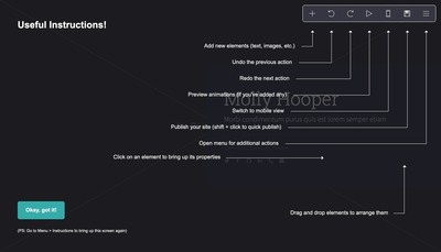
Example
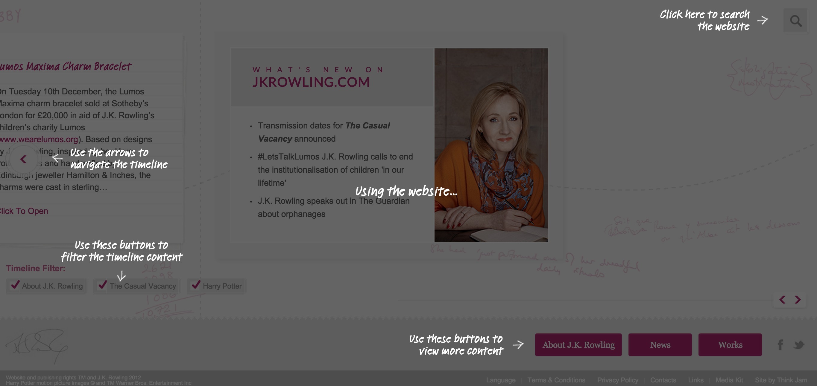
▲ A layover appers when you first enter JK Rowling's author website, explaining what you can do.
Usage
This card is part of the UI Patterns printed card deck
A collection of 60 User Interface design patterns, presented in a manner easily referenced and used as a brainstorming tool.
Get your deck!More examples

Solution
Display text, arrows, and images atop a modal overlay explaining the function of the interface.
Coachmarks represent multiple help call-outs that appear on a transparent overlay. By using text and often arrows and images, they point to and explain the functionality of the user interface.
Rationale
Coachmarks can help explain overly complicated or novel user interfaces to users, but they do not help solve the underlying problems of poorly composed interfaces. Consider other onboarding patterns before settling with coachmarks.
Discussion
Using coachmarks adds another mode (or layer) to your user interface. They thereby obstruct interaction to the elements they help explain. If users are in the middle of a task, coachmarks can be perceived as an obstruction, which they may want to quickly dismiss without reading.
This makes the Coachmark pattern borderline an anti-pattern: they do not solve the underlying problems of a confusing user interface. Adding a new level of complexity to help explain an already complex interface is treating symptoms and not the root course.
Furthermore, attention is diverted from one single tip to the explanation of the entire user interface. You are essentially asking the user to memorize not only how to solve the task at hand, but also all other tasks that might come at hand. Multiple coachmarks increase the cognitive load – especially on shot-term memory.
Address underlying issues first
Before settling on using Coachmarks, try to see if you can solve the problem in other ways first. Address any underlying user interface issues before you introduce Coachmarks. Consider a Playthrough or a Guided Tour, which allow users modeless assistance where they can interact with the elements about which they are being instructed.
If you must use Coachmarks, be easy on the users cognitive load. We can only remember 3-4 things at a time. Lay out coachmarks in a readable and easy-to-skim way. Instead of merely displaying a screenshot, try placing the Coachmarks above the user’s normal view of the user interface.
More examples of the Coachmarks pattern See all 5 example screenshots
User Interface Design Patterns
- Forms
- Explaining the process
- Community driven
- Tabs
- Jumping in hierarchy
- Menus
- Content
- Gestures
- Tables
- Formatting data
- Images
- Search
- Reputation
- Social interactions
- Shopping
- Increasing frequency
- Guidance
- Registration
Persuasive Design Patterns
- Loss Aversion
- Other cognitive biases
- Scarcity
- Gameplay design
- Fundamentals of rewards
- Gameplay rewards