Slideshow
Design Pattern
Problem summary
A collection of media needs to be displayed in a presentation as a sequence of still images.
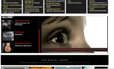
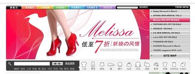
Example
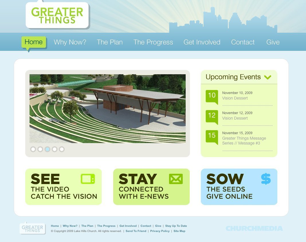
▲ Stylistic thick border frontpage carousel.
Usage
- Use when you need to capture attention using multiple stories and minimize screen real estate.
- Use when you need to direct users’ attention toward stories that you have highlighted
- Use when you want to allow users to skim through several stories without scrolling, doing any other mouse movements, or using any other input devices.
- Do not use if you want users to view all stories at the same time.
- Beware of over-usage and combination with other animations, which can lead to making a website seem too busy and attention-demanding.
More examples


Solution
A slideshow shows several stories with images, one at a time. After a specific time interval one story is replaced by another – often with an animated transition.
Transitions
Transitions between images are most often a sliding effect although a simple fade is also a popular choice. The most important design choice when it comes to transitions is to make it seem natural. Animations should never be used for showing off; only to support the usability and understandability of UI.
Numbers, bullets, or thumbnails
Use numbers, bullets, squares, or thumbnails to represent all the images in the slideshow. These provide a visual mechanism for navigation and serve as indicators for slides seen and slides still remaining to be seen. Numbers, bullets, and thumbnails help set expectations of what is to come.
Use numbers if it’s important to let the user now exactly how many stories a slideshow has. Use bullets if it doesn’t matter, and thumbnails if you want to inspire the user to jump past the sequential order of stories that you’ve chosen beforehand.
Focus attention
Slideshows steal attention! Especially if they are combined with animated transitions. Put slideshows together with blinking advertisement and other bright, animated or otherwise attention-stealing elements on the page and you have mayhem. If more than one element screams for attention, the user will get lost. If you have multiple elements that scream for attention other than the slideshow, the slideshow will only help diffuse users’ attention instead of focusing it.
Consider whether your slideshow is going to represent the main and most important stories of your site – if it doesn’t, then leave out the slideshow. A slideshow directs attention towards itself. Don’t overdo it.
Buttons and good callout texts
Increase the effectiveness of your slideshow by adding buttons for each story that calls out for attention. Buttons help users know what to click. However, be careful not to fall in the common trap of just labelling your button with “Read more”, unless that is really the only action the user can do by clicking on that button. Texts like “Support”, “Donate”, “Buy”, and “Watch video” are much more effective in getting users to click and set expectations of what they will get.
Navigation
Common navigation elements include:
- Previous and next buttons
- Bullets, numbers, or thumbnails
- Callout buttons
In order not to present the user with too many options at first, consider hiding navigational elements (such as “previous” and “next” buttons) until users hover the slideshow image. Too many options at first can confuse users and make them go away before they even got started. Reveal their options as their interest is sparked.
Full image or tabs with title
Slideshows usually fall into one of the following categories:
- Either the image of the story fills the entire slideshow. The current story is represented by a big image that acts as a background with text on top. This version provide the biggest sensory experience as it focuses on as large images as possible.
- Or the stories in the slideshow is listed either horizontally or vertically on the side or below or on top of the image. This version focus on conveying titles and text more than a visual sensory experience. Use this type if the title of a story is so important that the user can’t wait till that one story is up.
Rationale
Slideshows highlight several different stories on the same screen real estate. They allow users to quickly skim through stories. Slideshows capture the user’s attention and retain attention with simple navigation, captivating content and calls to action. They focus users’ attention sharply on the content instead of interacting with the browser.
1 Slideshows In Web Design: When And How To Use Them by Matt Cronin at smashingmagazine.com
More examples of the Slideshow pattern See all 57 example screenshots


User Interface Design Patterns
- Forms
- Explaining the process
- Community driven
- Tabs
- Jumping in hierarchy
- Menus
- Content
- Gestures
- Tables
- Formatting data
- Images
- Search
- Reputation
- Social interactions
- Shopping
- Increasing frequency
- Guidance
- Registration
Persuasive Design Patterns
- Loss Aversion
- Other cognitive biases
- Scarcity
- Gameplay design
- Fundamentals of rewards
- Gameplay rewards