Navigation Tabs
Design Pattern
Problem summary
Content needs to be separated into sections and accessed using a flat navigation structure that gives a clear indication of current location.
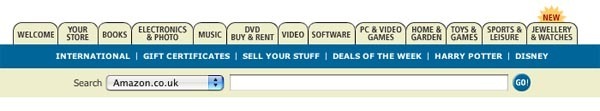
Example
Usage
- Use when there are between 2 – 9 sections of content that need a flat navigation mode.
- Use when section names are relatively short
- Use when you want the navigation to fill the entire width of a page
- Use when you want to provide a list of the highest available sections/subsections of the website
- Do not use when wanting to show content-specific data. For instance for showing latest articles
- Do not use when there is no need to single-out the currently selected option
- Do not use when the list of sections or categories call for a “more…” link. Then consider another navigation pattern.
More examples


Solution
- A horizontal bar contains the different sections or categories of your website.
- Each section or category is represented by a tab that most commonly resembles a button. This is why the whole button should be clickable, and not just the text that labels the section.
- Optionally, a bar below the top bar can contain subsections of the currently selected item in the top bar
- The navigation tab is persistent across all pages that the tabs link to.
- The same structure (order) of the navigation tabs should be maintained from page to page, so that the user can relate the navigation of the different pages to each other.
- The selected tab should be highlighted to indicate current location.
- If subsections are used (a second horizontal bar below the top bar) there should be a clear visual connection between the currently selected top tab and the bar below showing subsections.
Rationale
The Navigation tabs pattern is an extension of the desktop metaphor in which physical objects are represented as GUI elements. Navigation tabs are derived from the idea of folders in a file-cabinet and are thus familiar to the end user
Navigation tabs provide a clear visual indication of what content can be found on a website and places the current location in context by highlighting it.
This article has been commented 3 times.
More examples of the Navigation Tabs pattern See all 25 example screenshots
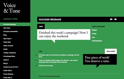
From voiceandtone.com
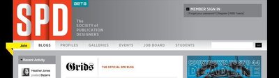
From spd.org
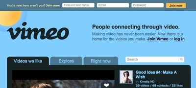
From vimeo.com
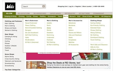
From rei.com

From germanwings.com

From tutorial9.net
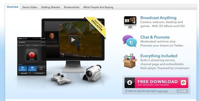
From livestream.com
User Interface Design Patterns
- Forms
- Explaining the process
- Community driven
- Tabs
- Jumping in hierarchy
- Menus
- Content
- Gestures
- Tables
- Formatting data
- Images
- Search
- Reputation
- Social interactions
- Shopping
- Increasing frequency
- Guidance
- Registration
Persuasive Design Patterns
- Loss Aversion
- Other cognitive biases
- Scarcity
- Gameplay design
- Fundamentals of rewards
- Gameplay rewards
3 comments
Rob McKeown on Oct 13, 2009
I think it is important to add that the background color of the selected tab should match (or at least seamlessly transition into) the background color of the “contents” of the tab. This visually ties the content to its tab.
Stephen Holmes on Jan 20, 2011
Actually Jacob said:
“…use tabs to alternate between views within the same context (not to navigate to different areas).”
The main issue is not to use it as primary navigation, but its use in switching between similar sets of contextual information is valid.
So the example is out of data and perhaps the pattern could be updated?
Jody Salt on May 03, 2011
@Stephen Holmes – I agree with update needed
I think the Amazon example (according to Jacob’s definition) is still semi valid because the tabs are flipping between sets of products. Though I think the blue bar (below the tabs) sort of breaks it. Though you could argue that the tabs are flipping between website objects so it could still be valid. Or if you treat Amazon as an app, you are simply flipping between views of the database based on department.
I think the main reason for Amazon abandoning tabs is that they now do so much more than just sell physical products.
What does everyone else think?
Comments have been closed