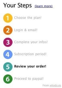
Steps Left
Design Pattern
Alternate titles: Workflow.
Problem summary
The user is about to go through the process of filling in data over several steps and is in need of guidance.
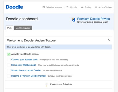
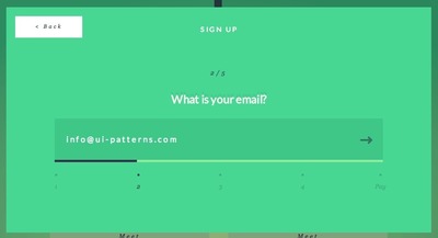
Example
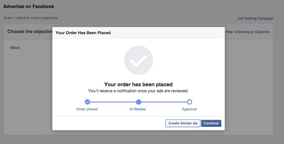
▲ Facebook uses the Steps Left pattern to indicate waiting time when reviewing a submitted ad campaign.
Usage
- Use when a user goal can be split into a series of smaller steps that is easier displayed on separate screens.
- Use when the steps of a process is so long that the user might get the impression that it will go on forever without the guidance of steps.
- Do not use when there is only 1 or 2 steps in submitting data to the website.
- Do not use when the process of filling out data is easily foreseeable.
This card is part of the UI Patterns printed card deck
A collection of 60 User Interface design patterns, presented in a manner easily referenced and used as a brainstorming tool.
Get your deck!More examples


Solution
Add a navigation block describing the steps involved in submitting data to the system. The block should always appear on the page. As the user progresses through the process, the navigation block is updated accordingly. The current step is highlighted, giving a clear indication to the user how far they have come and how much further there is to go.
Remove unnecessary distractions like extra navigation, advertisements, and the likes.
Rationale
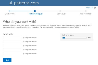
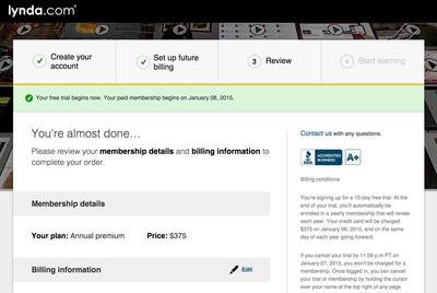
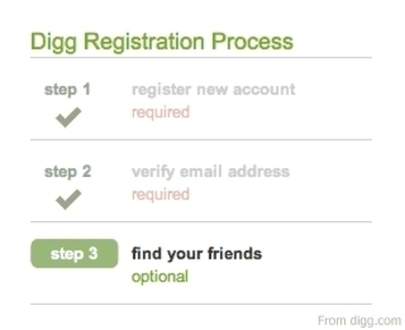
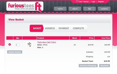
The Steps Left pattern is used when it is critical to maintain the user’s focus throughout the process of filling in data to the system. This is for instance critical in e-commerce websites, where the checkout process is often guided by this pattern. In e-commerce websites, the checkout process is the most critical part of the site, as this is the part that captures the customer’s money. The Steps Left pattern provide the user with a great overview of how far in the process the user has gone: it provides a visible end to the process, which the user can aim for.
This pattern is similar to the Wizard pattern most commonly found in desktop applications, which guide the user step by step.
More examples of the Steps Left pattern See all 69 example screenshots

User Interface Design Patterns
- Forms
- Explaining the process
- Community driven
- Tabs
- Jumping in hierarchy
- Menus
- Content
- Gestures
- Tables
- Formatting data
- Images
- Search
- Reputation
- Social interactions
- Shopping
- Increasing frequency
- Guidance
- Registration
Persuasive Design Patterns
- Loss Aversion
- Other cognitive biases
- Scarcity
- Gameplay design
- Fundamentals of rewards
- Gameplay rewards
1 comment
Jasper Kennis on Mar 20, 2008
Tels the user how far he’s already come, and how long a process is still to take. Good feedback and feed forward at once, great success! Without it, its as if someone is pointing at you with a flashlight. You can see whats behind you, and you can see where the light is, but you can’t see behind that and between you and the light its hard to see too.
Comments have been closed