Tip A Friend
Design Pattern
Alternate titles: Tell a friend.
Problem summary
The user wants to share something of interest with a peer.
Example
Usage
- Use when the user might want to spread the word about something on your site, but find it difficult to shorten
- Use when the user might think something on your site is interesting for other people.
- Use when you want users to share content on your website.
Solution
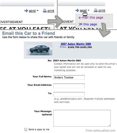
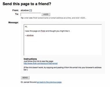
Add a link with a similar text to “Tip a friend”, “Send this to a friend”, “Share this with a friend”, that leads to a form to be filled out with the user’s data as well as a private message. The result of the form could be a mail sent out to the user’s friend with a condensed formed version of the content or simply a link to the original content.
Rationale
The Tip A Friend pattern is a function that facilitates the user’s need to easily spread the word about content. It can be useful if the information of interest is formatted in a way, that makes it hard to copy-paste into an understandable mail. The website can then help format the mail by setting up the info in a nice and readable format.
The usefulness of this pattern when just letting the user send a blank mail with a link to the content in question, can be debated. The users need for this kind of functionality is often not justified.
More examples of the Tip A Friend pattern See all 4 example screenshots
User Interface Design Patterns
- Forms
- Explaining the process
- Community driven
- Tabs
- Jumping in hierarchy
- Menus
- Content
- Gestures
- Tables
- Formatting data
- Images
- Search
- Reputation
- Social interactions
- Shopping
- Increasing frequency
- Guidance
- Registration
Persuasive Design Patterns
- Loss Aversion
- Other cognitive biases
- Scarcity
- Gameplay design
- Fundamentals of rewards
- Gameplay rewards


8 comments
andy on Feb 03, 2008
I never use these because of the risk of the website harvesting my friends’ email addresses. It is therefore a broken pattern.
Jasper Kennis on Mar 20, 2008
Not only that, I don’t know anyone who will thank me for delivering him some extra spam. If I dó find something thats só intresting I want to inform someone, I’ll just send a mail with the url, I never use a “send a friend” link.
Holger Dieterich on Mar 26, 2008
As a website owner, keep in mind that this function could be misused by bots to automatically send spam to any e-mail address in the world right from your server.
Discourage spammers by omitting the “optional message” field.
scornflakes on Apr 04, 2008
I think, we can gladly abandon the “e-mail-this” approach for most applications, because of the spam problems and the ¿fact? that nearly nobody ever uses it. The IM/social network this option should stay and be developed, though. Consider that the Digg this button is just the e-mail this button evolved.
Bazooka on Mar 07, 2009
Bottom line:
A little convenient for user but very dangerous for the recipient.
april on Oct 22, 2009
noTHING
Jessica Lake on Jun 16, 2011
I’m torn when it comes to this. I use it to share relevant info and articles with from friends but it’s only from REPUTABLE sites. I get a ton of spam as it is and I know part of it is due to my friends returning the favor with less reputable sites. Its a blessing and a curse. :-)
Mong on Oct 05, 2011
Does this old generation TAF still work? I go with the view that it attracts more spam then good. :)
Comments have been closed