WYSIWYG
Design Pattern
Alternate titles: What You See Is What You Get.
Problem summary
The user wants to create content that contains rich media and formatted text but does not the knowledge or time to write HTML.
Example
Usage
- Use when you want to give the user a clear indication of what their content will look like when it is published. WYSIWYG is an acronym for What You See Is What You Get.
- Use when the users of a site are not comfortable with formatting text using HTML codes or a markup language such as textile or markdown.
- Use to lower the barrier of letting your users add formatted content to your site.
- Use when you want an easy way to integrate media into the formatted content of your site that does not require HTML or any other syntax knowledge.
- Use when the user is inclined to spend time correcting small details on their content. WYSIWYG allows users to see formatted results as they edit, this increases their confidence and allows for quick and good looking results.
- Do not use if you want to keep the HTML syntax clean. Many WYSIWYG editors are known to produce bloated and untidy HTML code.
- Do not use if you want the editor to function in all browsers. WYSIWYG editors rarely support all browsers, and if they do, it is often only the latest releases of the browsers.
Solution
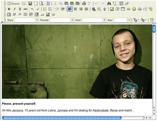
There are many javascript libraries available online that will convert a <textarea/> HTML element into a fully functioning WYSIWYG editor. The editor displays a work area that is both input and the final formatted output. The content is stored as HTML in a database.
Editors can be customized to your user’s needs. You can disable unnecessary functions. You might choose to not allow image inserts, tampering with font color or size – or even force the user to only use a predefined list of CSS classes.
Rationale
WYSIWYG (What You See Is What You Get) was initially introduced in word processors such as WordPerfect and Microsoft Word. It was then a revolutionary way to write documents, where the editor on the screen mimicked the result in print.
Recently, WYSIWYG editors were introduced to forms on the web. Previously, long text was inserted into <textarea/> fields, with no formatting options what-so-ever. WYSIWYG editors now allow the input to mimic what will be seen on screen.
User Interface Design Patterns
- Forms
- Explaining the process
- Community driven
- Tabs
- Jumping in hierarchy
- Menus
- Content
- Gestures
- Tables
- Formatting data
- Images
- Search
- Reputation
- Social interactions
- Shopping
- Increasing frequency
- Guidance
- Registration
Persuasive Design Patterns
- Loss Aversion
- Other cognitive biases
- Scarcity
- Gameplay design
- Fundamentals of rewards
- Gameplay rewards

6 comments
Shahar on Feb 07, 2008
I’d have hoped that the site would do more to promote good usability practice, not just document common techniques.
Dropdowns for navigation is #1 poor usability design. Getting rid of the ‘Go!’ button is #2.
A reference for Good techniques and practices would be very useful. A library that doesn’t discriminate between good and bad practice will just compound the interface problems that already exist.
(apart from that that, this is a very nicely put together site and if the content is chosen carefully would be a great resource)
Janko on Mar 26, 2008
I agree with Sharar. This technique shouldn’t be used. It is in contrast with good UI design best practices.
Gustav on Mar 28, 2008
Great, but some links to JS libraries would be useful.
Anders Toxboe on Mar 30, 2008
Gustav: The links are already here. Check the links under “See it in action” in the sidebar.
Job Search Guy on Mar 02, 2009
does anyone know how i can remove the text styling when content is pasted into an editor?
Jon Scalet on Mar 02, 2011
For functionality and overall ease of use the other good options out there are tiny and ckEditor. We actually made the switch to ck because of the poor usability of tiny. Just my $.02 for anyone looking into WYSIWYG editors.
Comments have been closed